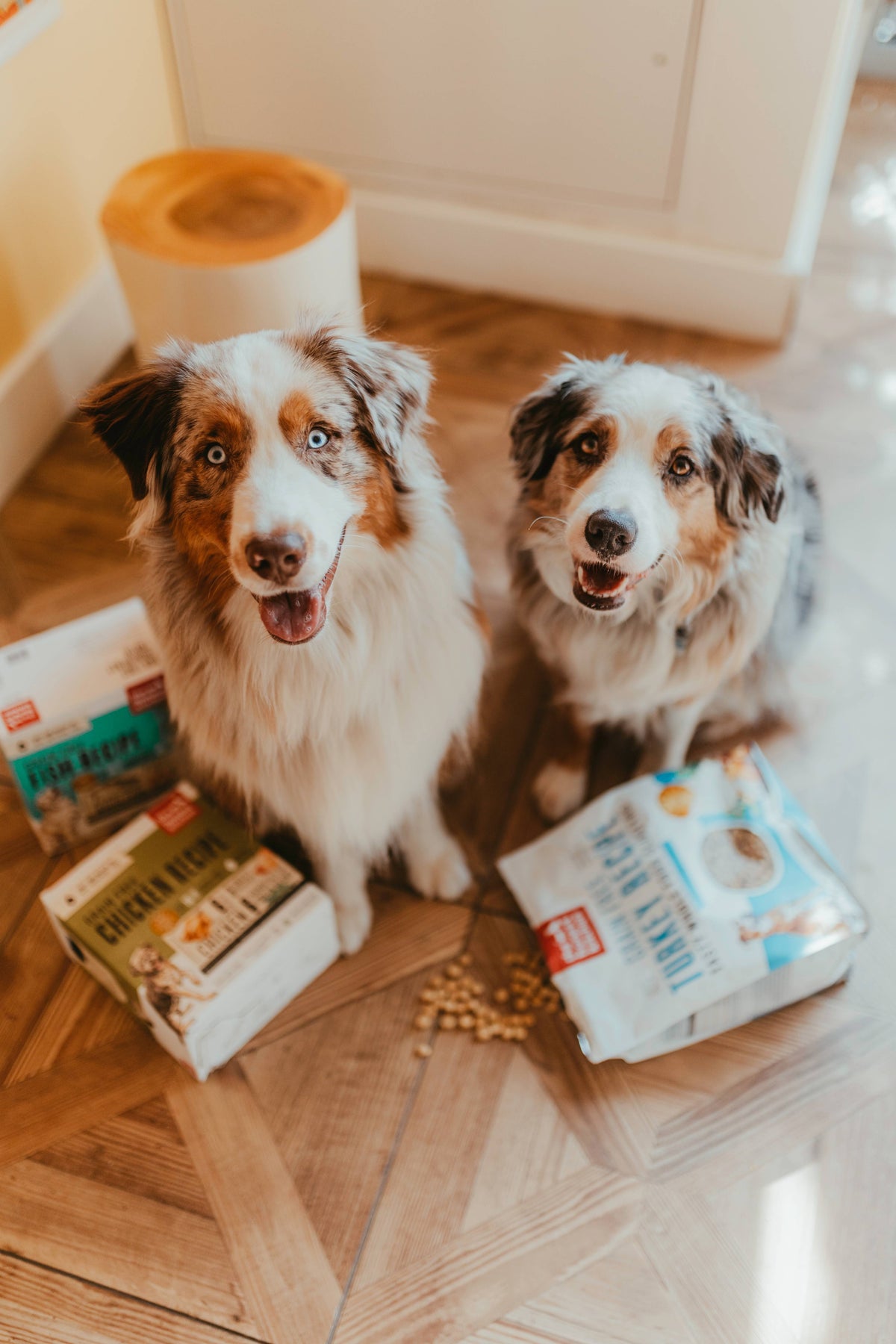
The Honest Kitchen
What we did
Industry
Pet Food
Tools
Figma
Year
2024
Overview
Founded in 2002, The Honest Kitchen is a premium pet food brand specializing in human-grade nutrition for dogs and cats. Known for its commitment to whole food ingredients and nutritional transparency, the company has become a leader in the natural pet food space with a strong storytelling-driven eCommerce presence.
The Honest Kitchen approached the redesign with a clear challenge: evolve the eCommerce experience without losing the familiarity and equity already established within the brand. The project centered on transforming an aging Shopify implementation into a scalable, performance-driven experience that could better support both conversion and storytelling.
The result was a faster, more intuitive storefront designed to support both returning subscribers and first-time customers navigating a highly educational product category.
The redesign focused on rebuilding the customer journey from the ground up, simplifying product discovery, reducing friction across mobile commerce, and creating a flexible content system that could scale with the brand over time. Rather than pursuing a complete visual reinvention, the work prioritized UX architecture, modular wireframing, and strategic content hierarchy to improve usability while preserving The Honest Kitchen’s recognizable identity within the pet nutrition space.
01. Streamline the Path to Purchase
- Reduce friction across the shopping journey.
- Minimize clicks to purchase for returning customers.
- Improve mobile responsiveness and overall usability.
- Increase subscription visibility and adoption.
02. Balance Education with Conversion
- Merge product education with intuitive merchandising.
- Present concise, high-value product information.
- Create engaging content experiences that encourage exploration and reduce bounce rate.
- Strengthen brand storytelling throughout the shopping experience.
03. Build a Scalable Commerce System
- Develop a flexible, future-proof Shopify architecture.
- Create a modular component system for internal teams.
- Improve content management autonomy and workflow efficiency.
- Maintain performance, accessibility, and long-term scalability.
Design Process
UX Audit & Journey Mapping
The project began with a full UX audit and analytics review of the existing storefront to identify friction points across navigation, PDPs, collection browsing, mobile responsiveness, and checkout pathways.
Particular attention was placed on:
– Product discovery behavior
– Scroll depth and content prioritization
– Mobile interaction patterns
– Subscription visibility
– Redundant click paths
– Information overload within PDPs.
From there, user journeys were mapped around two core audiences:
Returning customers looking for fast repeat purchases and first-time visitors requiring product education and reassurance.
Returning customers looking for fast repeat purchases and first-time visitors requiring product education and reassurance.
")
")
")
")
")
")
")
")
")
")
")
")
")
")
")
")
")
")
")
")
Challenges
One of the primary challenges was designing for two fundamentally different user behaviors within the same ecosystem.
Returning customers already understood the products and wanted speed, efficiency, and minimal friction to reorder. New customers, however, required significantly more education around ingredients, feeding formats, product benefits, and subscription options before feeling confident enough to purchase.
This created a tension between storytelling and conversion.
The existing experience also suffered from structural inconsistencies inherited from their previous theme foundation. Content layouts lacked cohesion, mobile usability issues impacted browsing behavior, and the overall system made it difficult for internal teams to maintain consistency across landing pages and campaigns.
From a UX perspective, the challenge became less about “redesigning pages” and more about rebuilding the decision-making journey:
- How can educational content support conversion without slowing down shopping behavior?
- How can product information become more digestible and actionable?
- How can merchandising adapt to both exploratory and repeat purchase behaviors?
- How can the interface scale without introducing operational complexity for internal teams?
The redesign needed to solve these questions while maintaining performance, accessibility, and brand familiarity.
Information Architecture & Navigation
The information architecture and navigation system were redesigned to better accommodate a wider range of shopping behaviors, balancing fast product access for returning customers with clearer discovery pathways for new users.
The updated IA refined category structures and reordered navigation priorities to create a more intuitive browsing experience. New organizational layers, including Breed Sizes and contextualized Life Stages, helped users navigate products based on their pet’s specific needs rather than solely by product type.
To better support educational content, a dedicated “Learn” top-level navigation category was introduced, consolidating brand storytelling, ingredient education, and blog content into a more accessible and visually engaging hub. Subscription content was also surfaced more prominently throughout the navigation to support awareness and conversion.
Language across the experience was simplified and made more user-centric, including reframing “Take the Quiz” into the more approachable “Which Food Is Right for You.” The footer navigation was similarly streamlined to reduce redundancy and improve content clarity across the site.


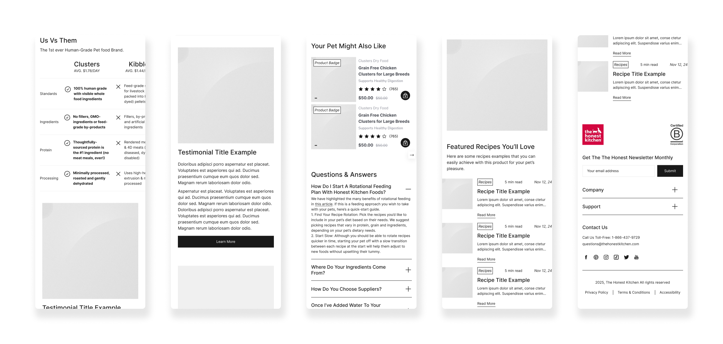
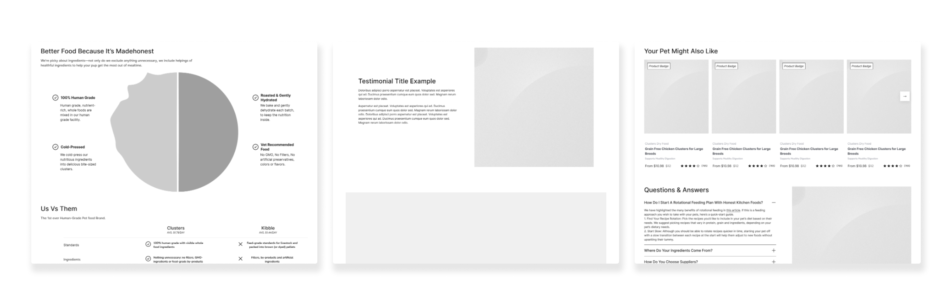
Wireframes
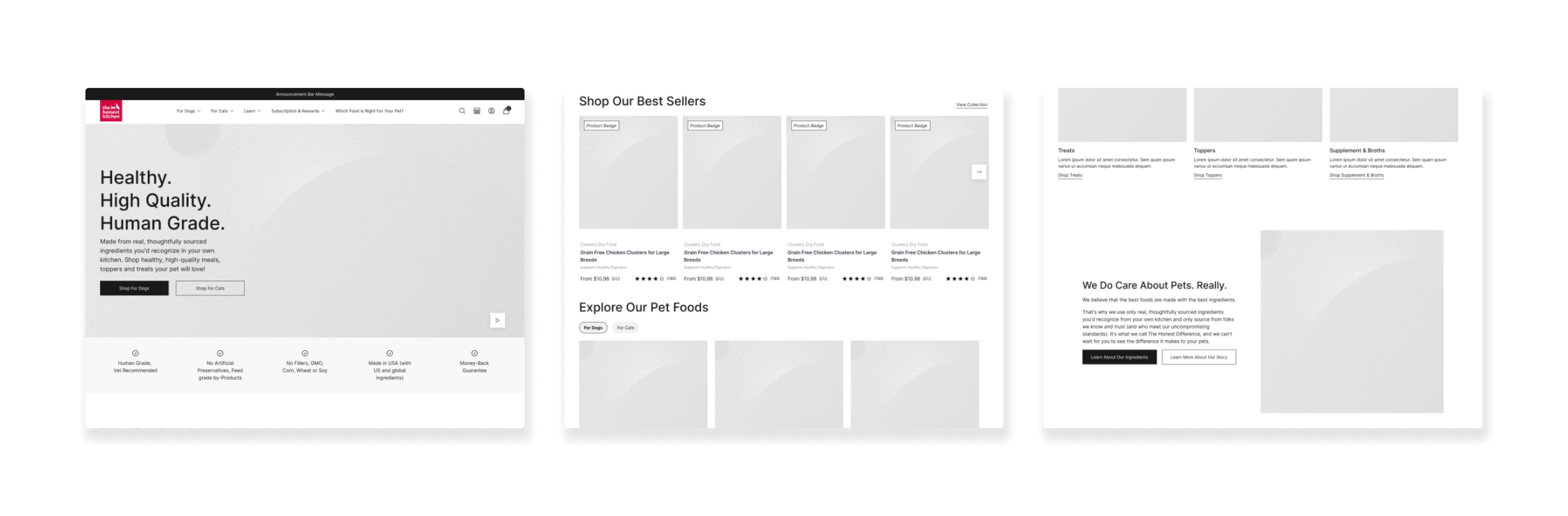
Homepage
The wireframing phase focused heavily on hierarchy, modularity, and behavioral flow rather than purely visual exploration.
The goal was to reduce cognitive load while preserving enough educational depth to support purchasing confidence from the very beginning of the path to purchase.
Key UX decisions included:
Introducing faster pathways to purchase through persistent quick-add interactions.
Reorganizing PDP architecture to surface essential product information earlier.
Structuring educational content into more scannable, progressive sections.
Reducing unnecessary navigation layers and interaction steps.
Designing modular content blocks that could adapt across campaigns and landing pages.
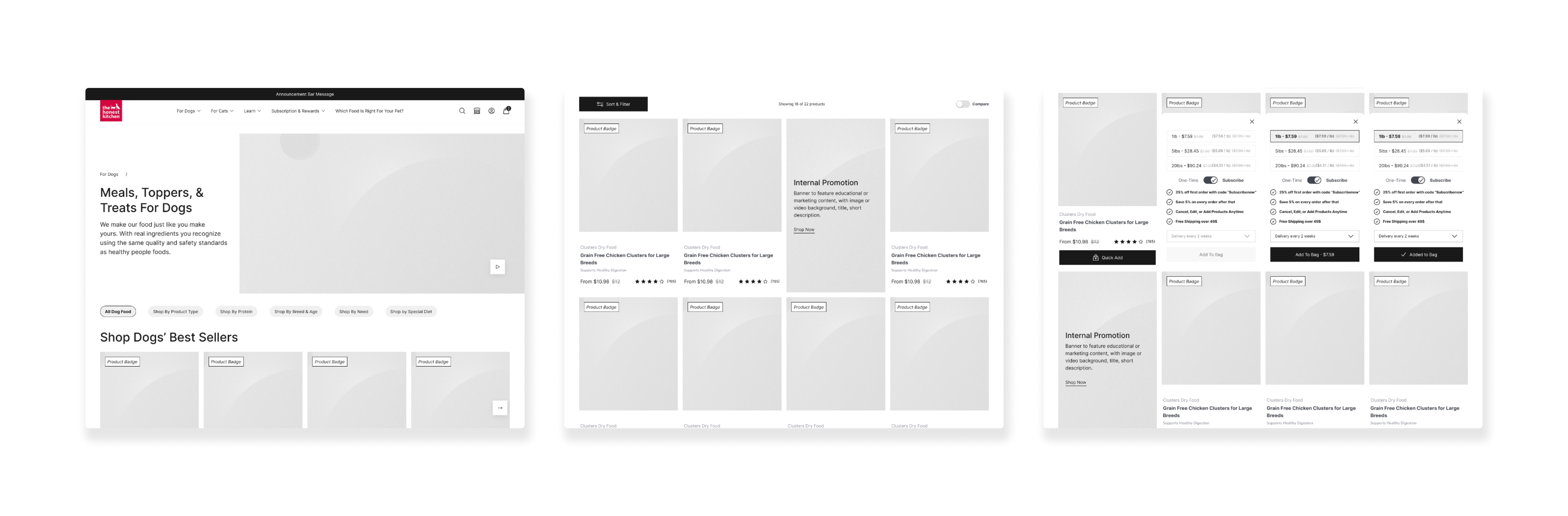
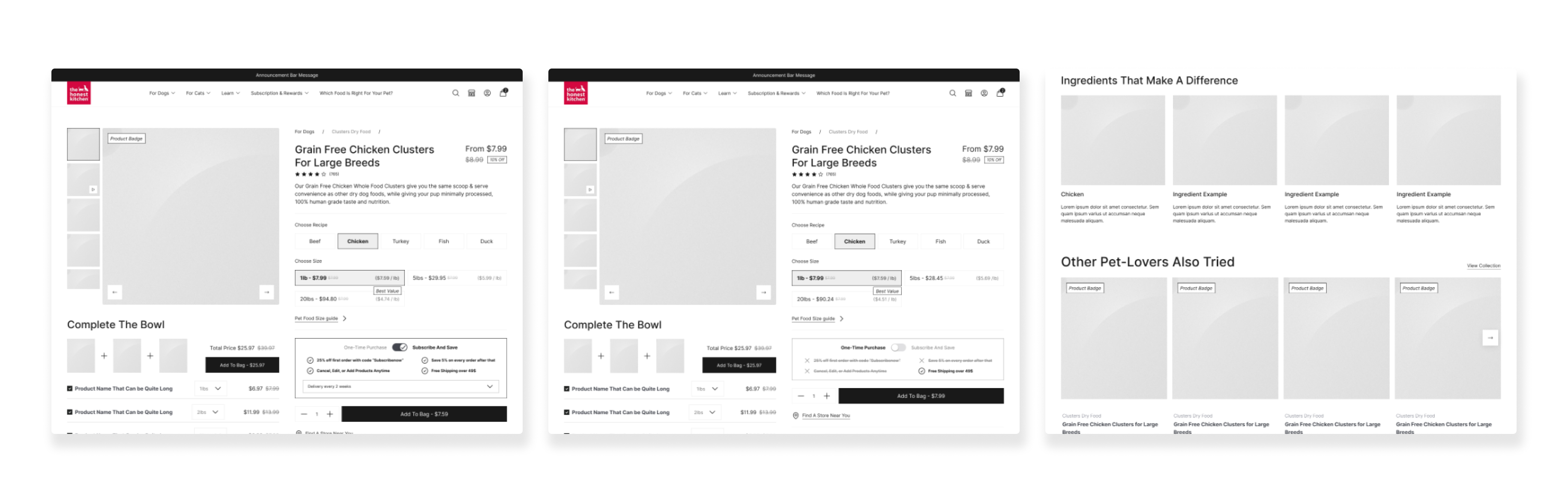
Wireframes
Product Cards
A major focus was balancing conversion-driven components with editorial storytelling. Instead of separating “brand” and “commerce,” the layouts integrated both into a unified experience where education naturally supported shopping decisions, on the product cards themselves, on PLPs with in-listing banners, or on Details pages.
Wireframes were intentionally system-based, allowing components to scale consistently across templates while giving the marketing team flexibility in page creation.
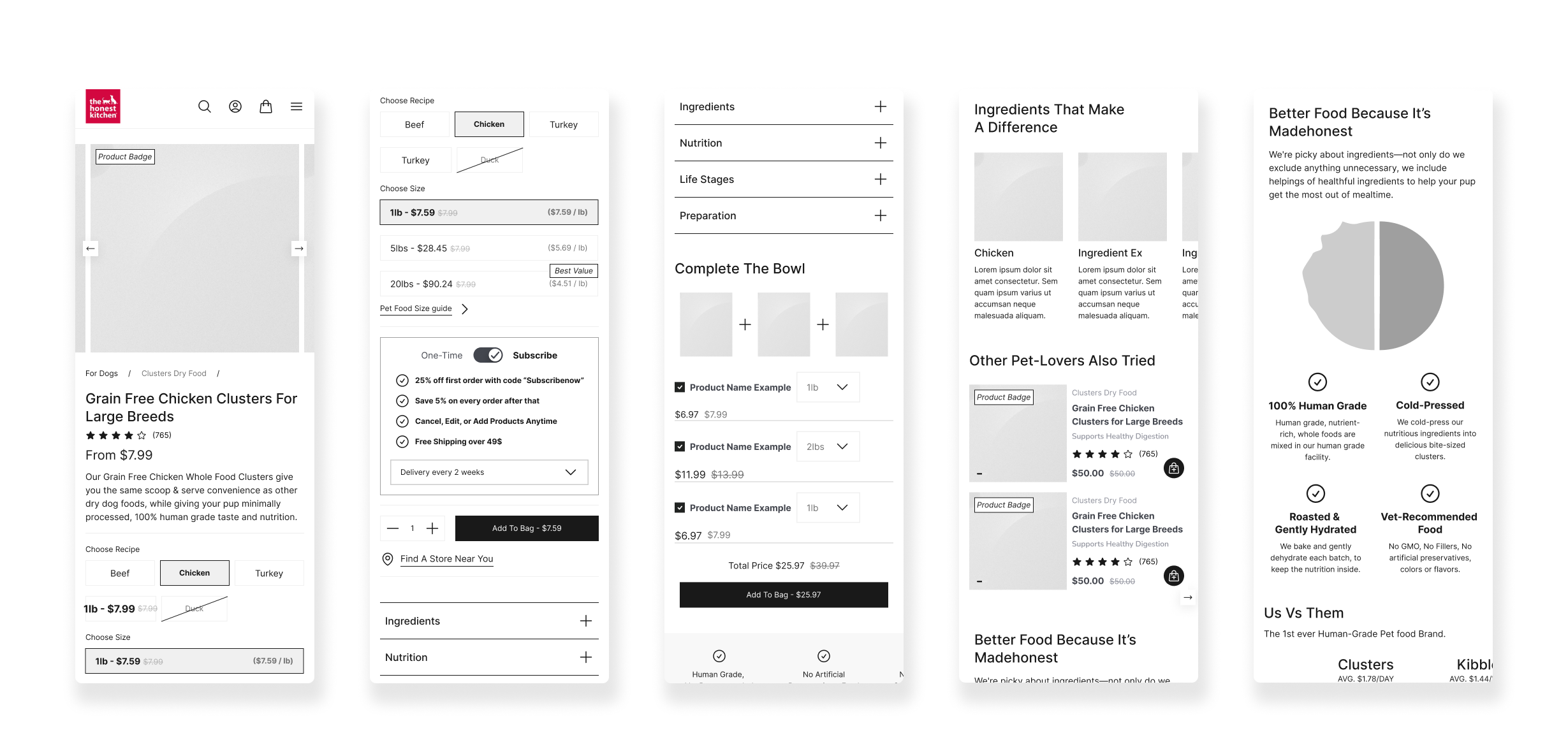
Wireframes
Product Detail Pages & Modular Design
Beyond customer-facing UX, the project also addressed long-term operational scalability.
A custom library of reusable Shopify sections and content modules was created to provide consistency across the site while giving internal teams greater autonomy. This reduced reliance on developers for routine merchandising and campaign launches.
The component system prioritized:
Flexible layout configurations
Consistent spacing and hierarchy
Scalable storytelling patterns
Mobile-first responsiveness
Accessibility standards
Performance optimization
This systems-driven approach allowed the brand to evolve content rapidly without compromising UX consistency.


Performance & Mobile Optimization
Because a significant portion of traffic came through mobile, responsiveness and performance became critical parts of the redesign process.
The experience was optimized around:
- Faster load times
- Cleaner mobile navigation patterns
- Reduced layout shifting
- Streamlined interactions
- More efficient product browsing
The build leveraged modern Shopify capabilities and native platform functionality to improve scalability while maintaining a lightweight front-end experience.
The Outcome
The final product delivered a more cohesive and conversion-focused eCommerce experience that better reflected The Honest Kitchen’s position as a premium pet nutrition brand.
The redesigned storefront successfully balanced education with usability — allowing new customers to learn confidently while enabling returning users to purchase with minimal friction.
Key improvements included:
- A more intuitive mobile shopping experience
- Faster pathways to subscription purchases
- Improved PDP usability and merchandising clarity
- Greater consistency across content and campaigns
- Enhanced internal publishing workflows through modular content systems
- Improved scalability and long-term maintainability
Most importantly, the redesign established a stronger UX foundation capable of supporting both brand storytelling and future eCommerce growth at scale.
Explore More
Explore More
Explore More
Explore More

Hilo App
Hilo App

Clos Des Saints