David’s Tea
What we did
Industry
Food & Beverages
Tools
Figma
Year
2024
Overview
Founded in Canada, DAVIDsTEA is a specialty tea retailer recognized for its diverse loose-leaf offerings and thoughtfully crafted blends. With a strong presence across North America, the brand has built a loyal following around tea as a lifestyle, balancing product education, discovery, and everyday ritual.
Partnering with the agency, DAVIDsTEA undertook a migration from Salesforce to Shopify Plus as part of a broader digital transformation. The initiative focused on redesigning the shopping experience around usability, product discovery, and operational autonomy, delivering a platform that could evolve alongside the business.
Central to the solution was a UX-led wireframing process and modular design system that translated a complex product catalog and localization requirements into a flexible, scalable digital experience that supports both customer needs and internal teams.


As e-commerce became a primary growth channel, DAVIDsTEA identified the need to modernize its digital foundation. The existing platform limited flexibility and made it difficult to scale, iterate, and manage content efficiently across markets.
Redesign the e-commerce experience with a UX-first approach focused on clarity, discovery, and conversion.
Establish a scalable design system and component library to support long-term growth.
Improve product findability across navigation, collection pages, and PDPs.
Enable localized shopping across language (EN/FR) and currency (CAD/USD).
Empower the internal team with modular content management and reduced developer dependency.
Migrate to Shopify Plus while preserving SEO equity and customer data.
Challenges
DAVIDsTEA’s product offering is broad, nuanced, and information-rich. Each tea requiring education, tasting notes, and context to support confident purchasing. The existing platform limited flexibility and made ongoing iteration difficult without developer involvement.
Key challenges included:
Translating a large, complex catalog into an intuitive navigation and discovery system.
Designing PDPs that balanced education, cross-selling, and clarity without overwhelming users.
Creating a flexible UX framework that could scale across markets, languages, and future features.
Ensuring design consistency while enabling modular, non-technical content updates.
Executing a platform migration without disrupting SEO performance or customer experience.
Design Process
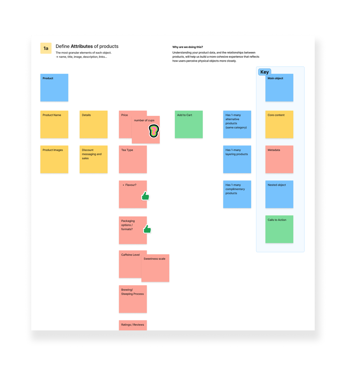
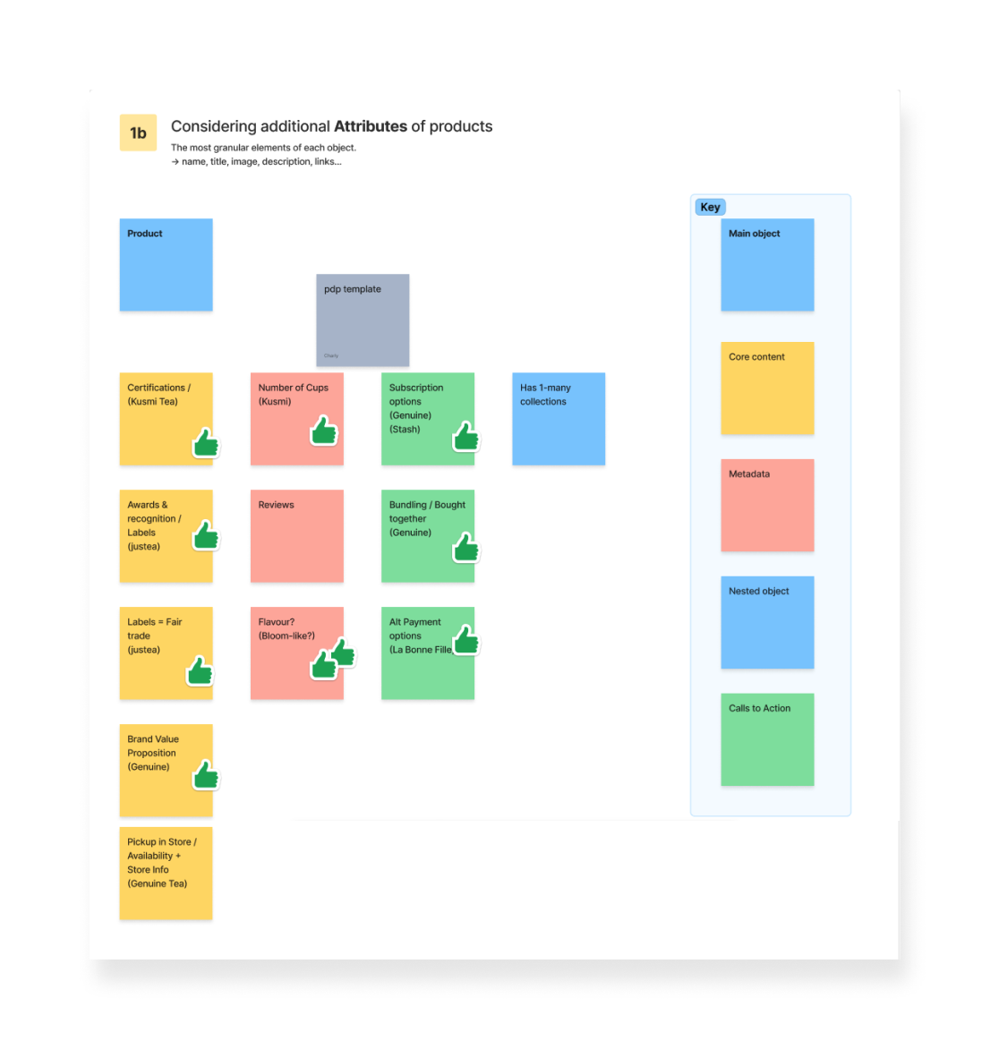
Product Attribute Workshop
As the UX lead on the project, I facilitated a Product Prioritization Workshop between the team and the client to establish a shared understanding of how products should be structured, represented, and surfaced across the digital experience. The objective was to align business goals, product data, and user expectations before moving into wireframing and system design.
Rather than starting with layouts or visual treatments, I focused the team on the underlying product logic, what information matters most to users during the purchase decision, and how product attributes should work together to support clarity, confidence, and findability.
Products are not just data objects; they reflect mental models users already have from real-world retail experiences. My role in this workshop was to translate those mental models into a coherent digital framework, one that could guide interface patterns, interaction behaviour, and component design.


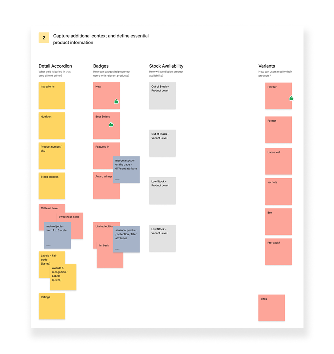
Capturing Context & Complexity
A key focus of the workshop was uncovering product context that typically creates friction later in the design process. I guided conversations around:
- Long-form product content and how it should be surfaced or structured
- Badge logic and how visual signals can help users identify relevant products
- Stock availability and its impact on user confidence and decision-making
- Variant selection and how users expect to modify products
By addressing these questions early, I was able to design UX patterns that surface the right information at the right moment, without overwhelming the interface.
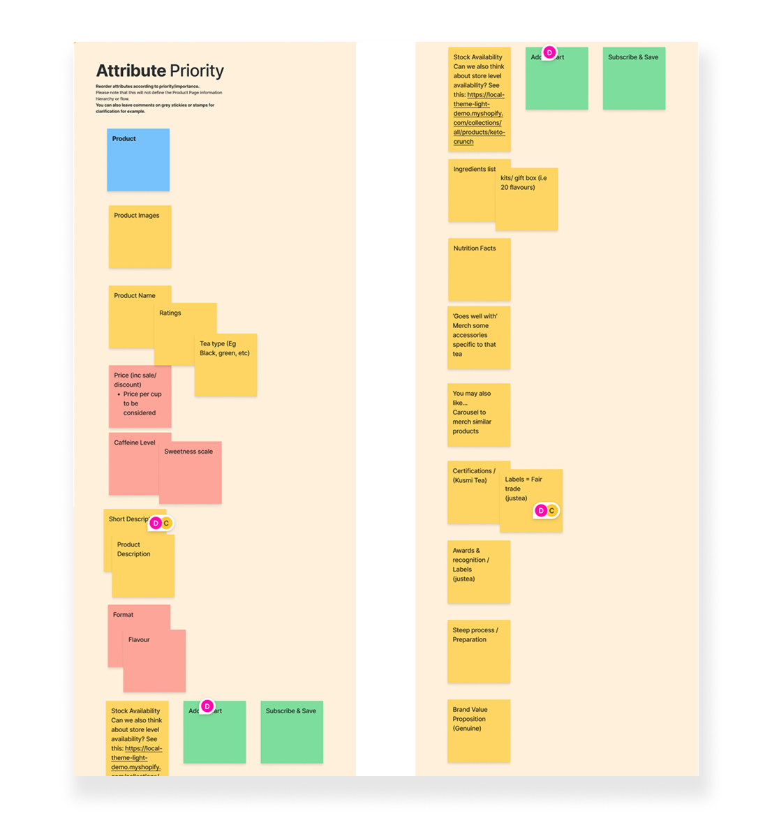
Attribute Prioritization
The final exercise involves product information based on user importance and decision impact. This step was intentionally separated from page layout or visual hierarchy. The outcome was a shared, validated understanding of informational priority, providing a strong foundation for wireframes, PDP frameworks, and reusable components.
By grounding early UX decisions in product prioritization, I ensured that the conceptual model (grammar, functionality, and structure) was defined before wireframes took shape. This significantly reduced ambiguity later in the process and prevented misalignment between design, content, and development.
The result was a more intuitive product experience, improved discoverability, and a scalable UX system, one that supports both user needs and long-term product evolution.
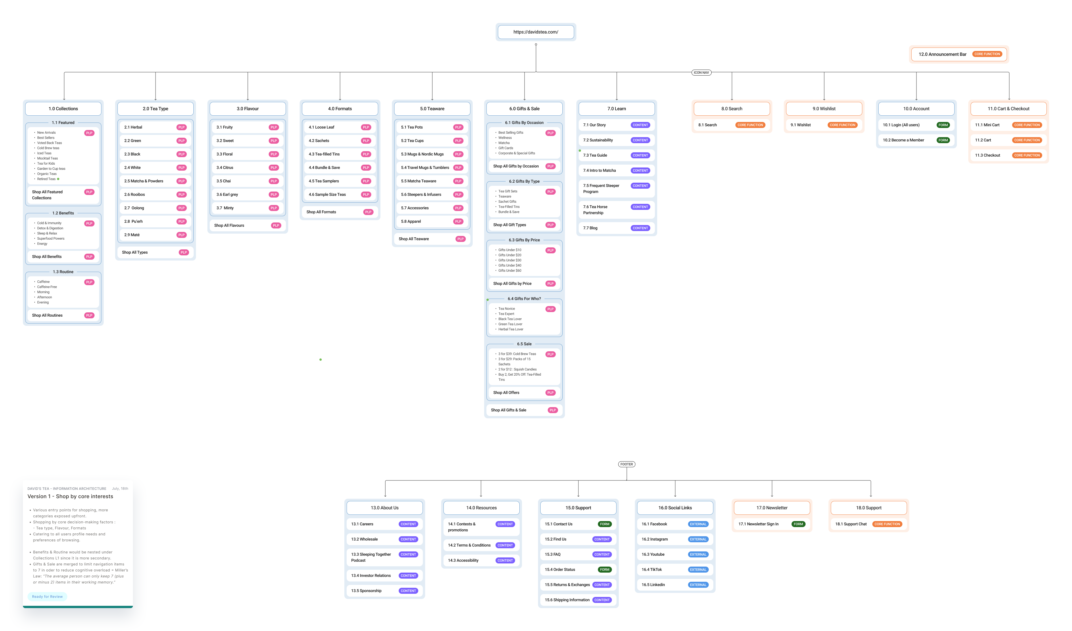
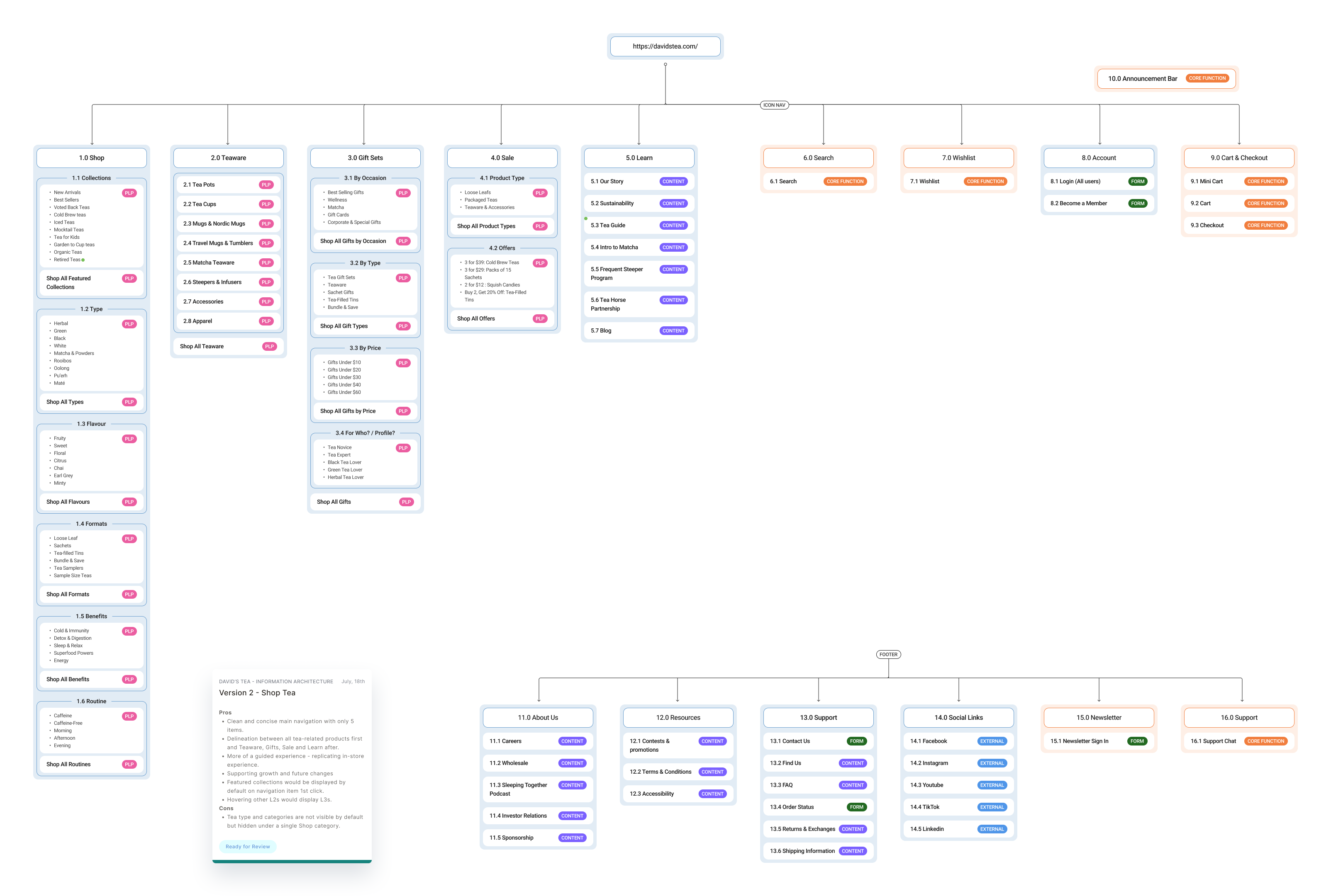
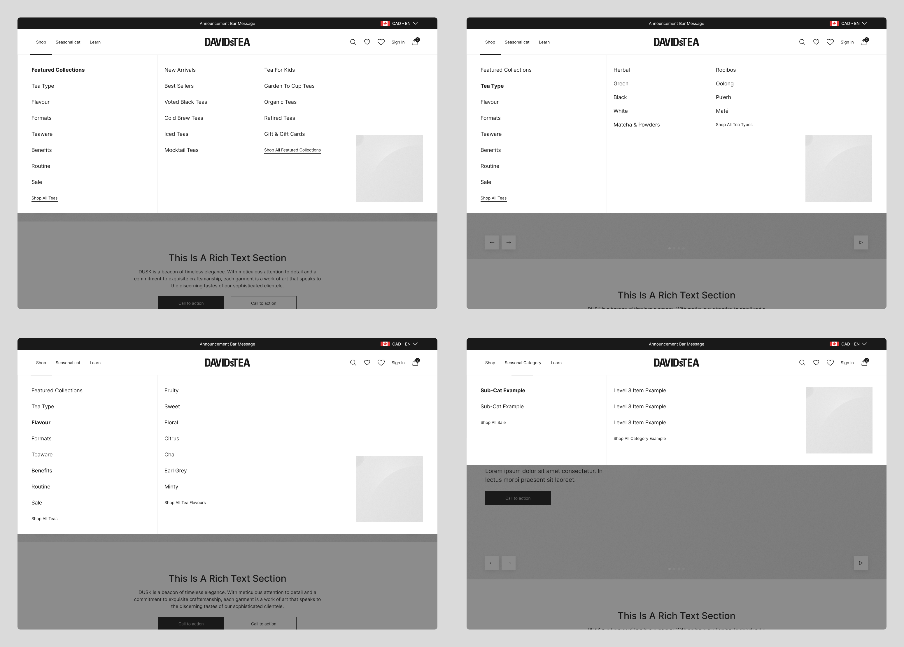
Information Architecture & Navigation
I focused the IA and nav wireframing work on simplifying how users browse, compare, and understand products. To ground structural decisions in real behaviour, I began with an internal qualitative survey among tea enthusiasts. The goal was to identify the primary decision-making factors when selecting a tea to create an insights-informed information architecture.
Based on these findings, I developed multiple IA directions, including:
- A restructured navigation optimized around collections, tea types, flavours, formats, occasions, and accessories.
- A second version nesting all product categories under a « Shop » label for a cleaner look and feel.


Final IA and Navigation
We presented both IA and navigation models to the client, outlining the UX benefits, trade-offs, and implications of each approach. While one option aligned more closely with usability best practices and user-first patterns, the client ultimately selected the alternative based on internal priorities and operational considerations.


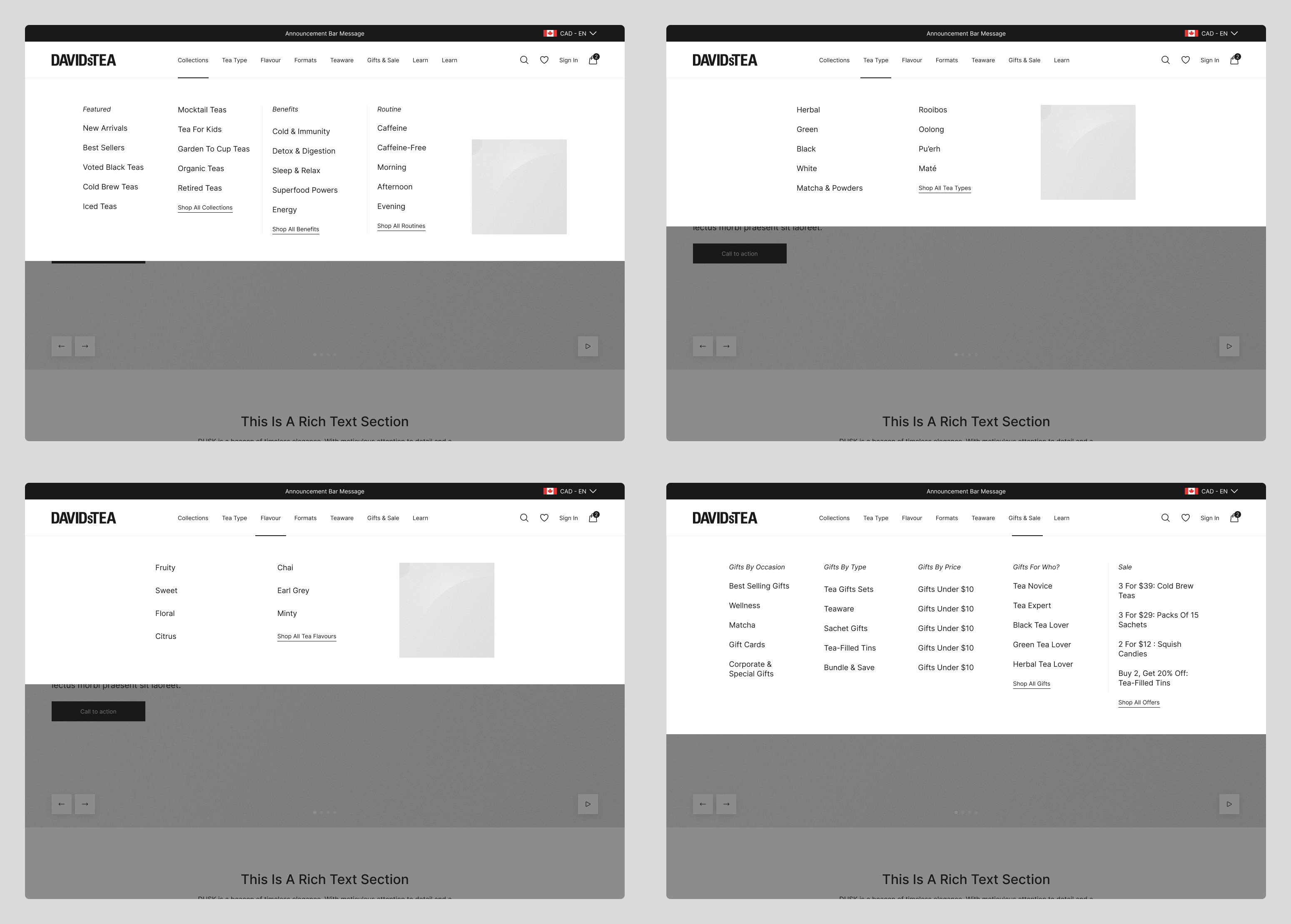
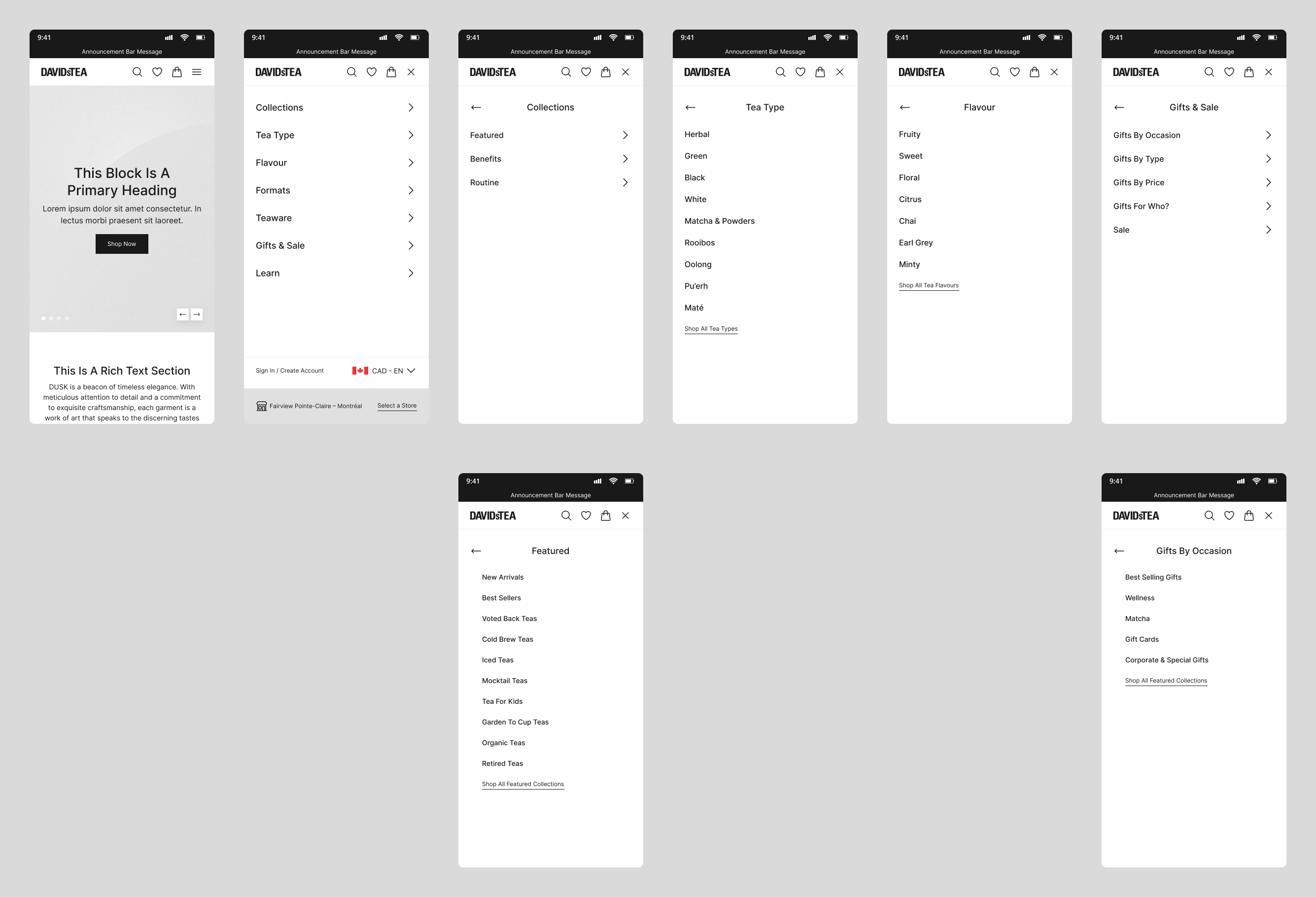
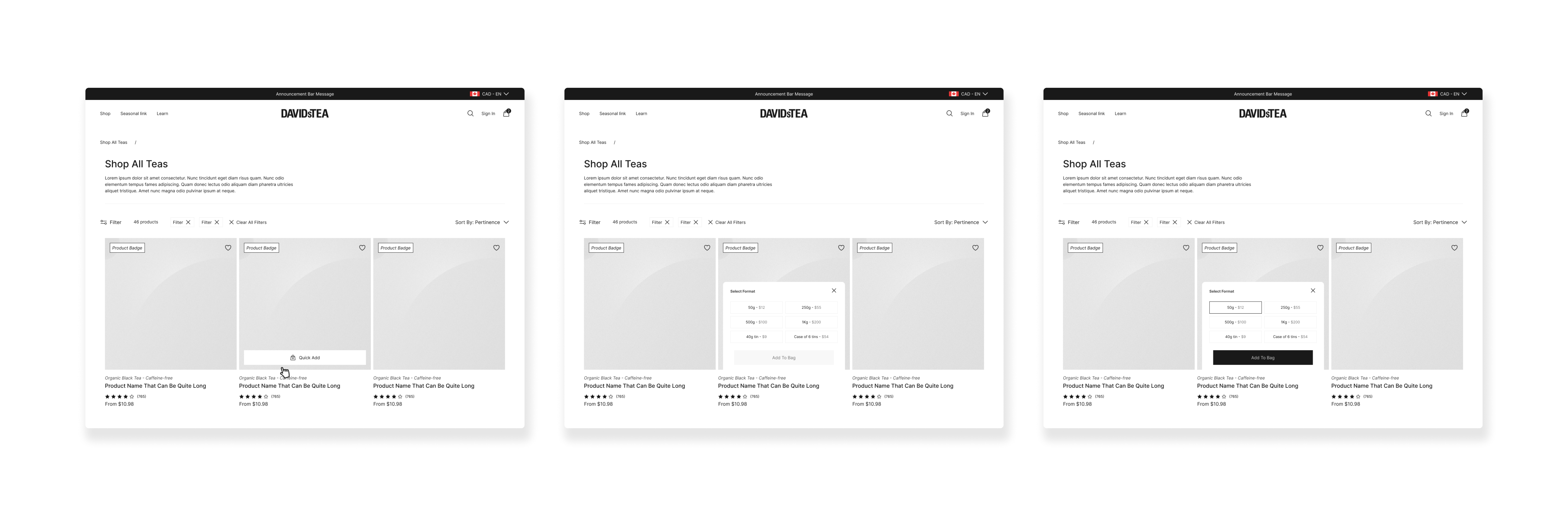
Wireframes
Product Cards
Product cards and variant selection were designed to consolidate all format variations within a single list item, with the total number of options clearly surfaced upfront. This improves visibility, reduces the risk of overlooking relevant formats, and helps users assess suitability before committing to a product detail page. To further streamline the flow, a quick-add interaction reveals an overlay on hover or tap, allowing users to select a preferred format and add it to cart directly, minimizing unnecessary page transitions and supporting faster, more confident purchasing.
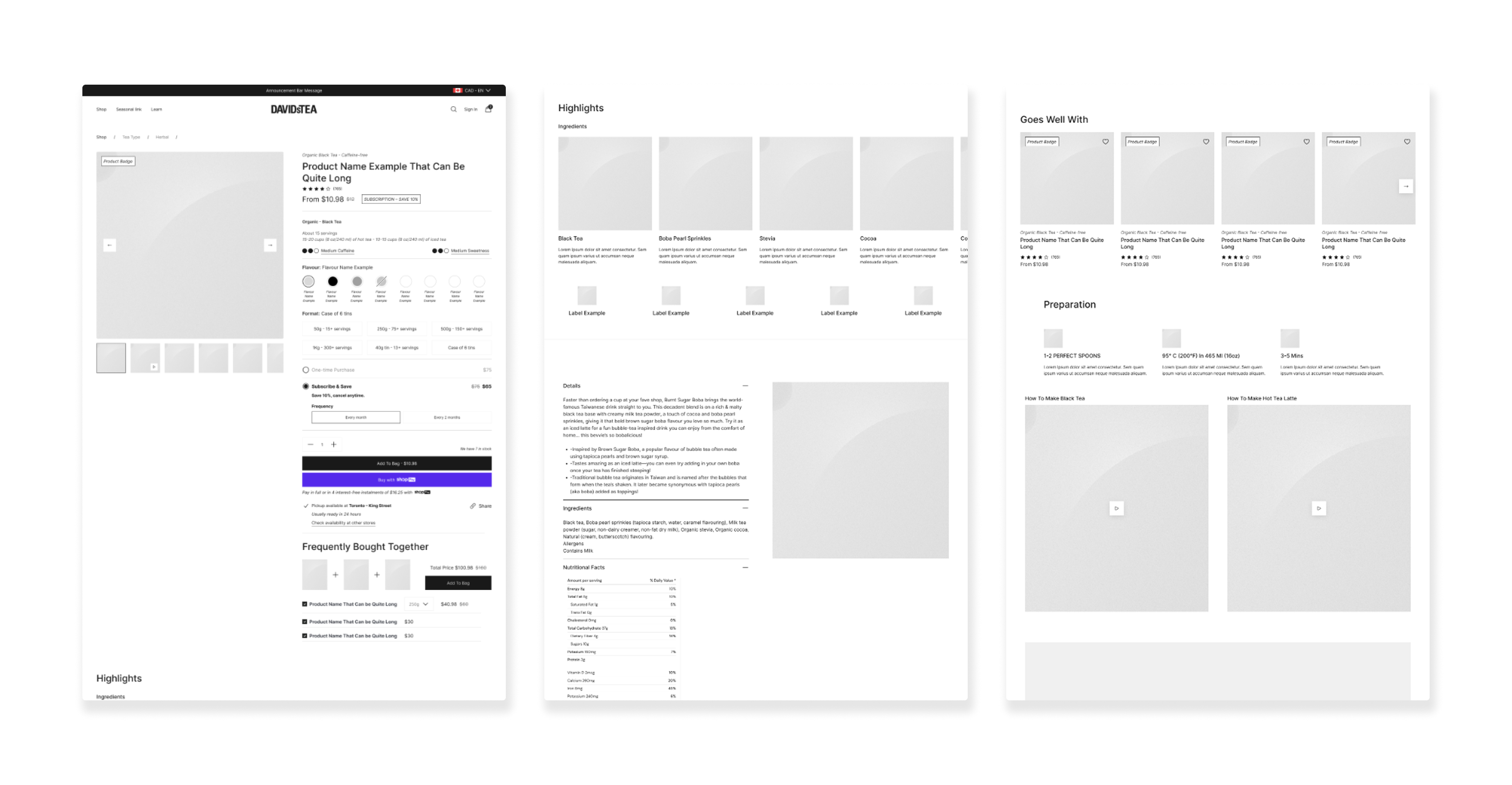
Wireframes
Product Detail Pages
We designed a flexible PDP system composed of five template types supporting direct purchase, subscriptions, hardgoods, and bundled products. Each template was built around a clear information hierarchy that surfaces essential product details, education, and contextual cross-sell opportunities without overwhelming the user. Modular sections were designed to scale across PDPs, collections, and key entry points, ensuring consistency while allowing for variation by product type. The resulting experience balances efficiency and depth, supporting quick purchasing decisions while providing the education and reassurance needed by both new customers and experienced tea drinkers.
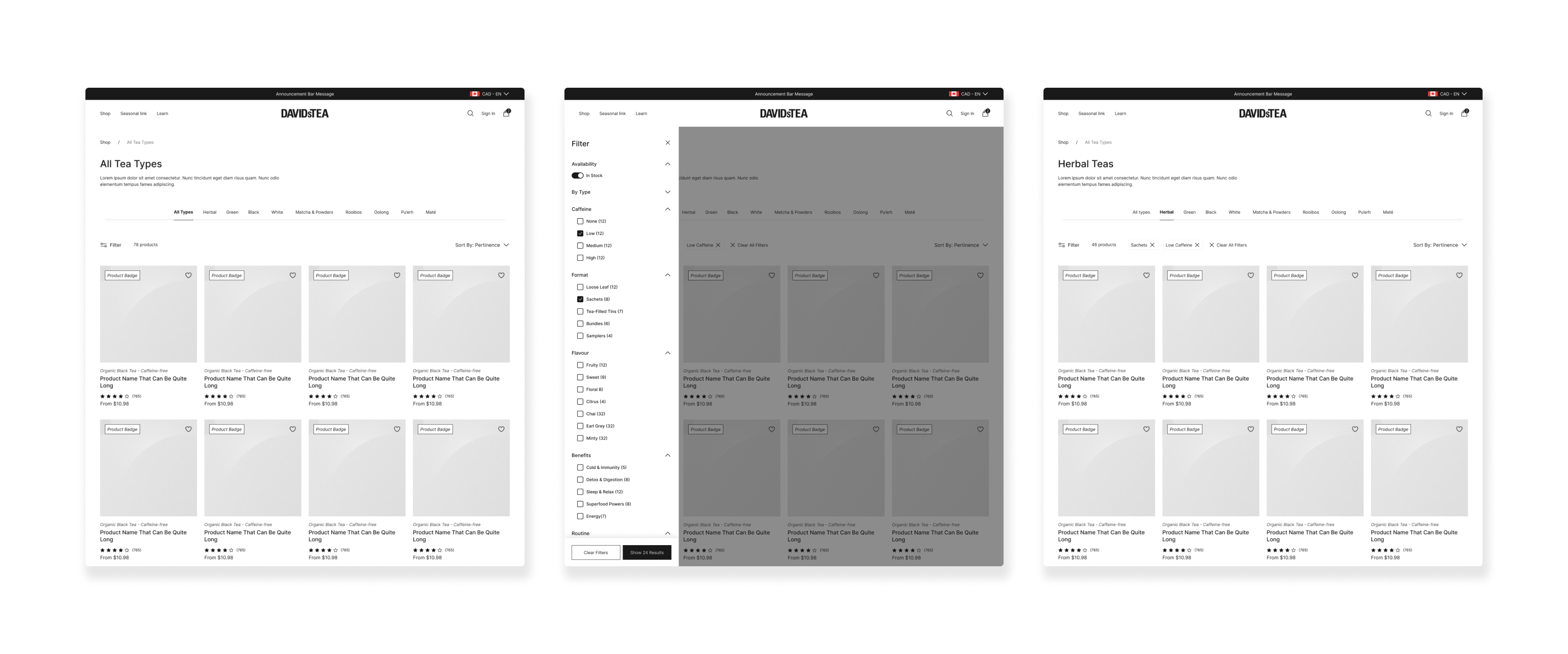
Wireframes
Listing Pages & Modular Components
Collection and listing pages were designed for efficient catalog exploration, with quick access to core tea categories surfaced at the top to support intuitive browsing. Layouts prioritized scannability, structured filtering, and clear product differentiation, enabling users to narrow options quickly without cognitive overload.
Impact & Outcome
The redesign delivered a more intuitive, decision-oriented commerce experience, reducing friction across discovery, evaluation, and purchase.
Clearer Discovery, Faster Orientation
Navigation and filtering were restructured around real tea selection behaviors, enabling faster orientation and clearer comparison across a complex catalog. Key product details, such as tasting notes, format options, and availability, were surfaced earlier in the journey, supporting more confident decision-making.
Reduced Interaction Friction
Interaction friction was reduced by consolidating variants and minimizing unnecessary page transitions, allowing users to assess suitability without repetitive back-and-forth exploration. Cross-sell logic was embedded contextually within the flow, reinforcing discovery without disrupting intent.
Scalable UX System
Behind the interface, a modular UX system ensures consistency across templates while supporting localization and multi-currency logic. The result is a scalable experience that feels seamless to customers and gives the internal team the flexibility to evolve the platform independently, without compromising usability or brand integrity.
Key Learning
Strong UX leadership isn’t about enforcing a single « ideal » solution; it’s about enabling informed decisions and creating clarity around trade-off implications.
When presenting two IA directions, I clearly articulated the usability implications, operational considerations, and long-term flexibility of each approach. While the selected direction differed from my recommended best-practice model, the decision was made with full awareness of its UX impact.
A similar discussion emerged around consolidating product variants into a single product item to streamline catalog exploration and reduce duplication across listing pages. From a usability perspective, merging variants supported cleaner browsing, improved comparison, and reduced cognitive load. However, late-stage business considerations led to maintaining separate product entries.
These moments reinforced an important principle: influence in UX comes from framing decisions with evidence, user logic, and long-term impact, not from controlling the final call. Strategic clarity builds trust, even when outcomes shift.
Explore More
Explore More
Explore More
Explore More

UHG Spark App
UHG Spark App

Clos Des Saints