Clos Des Saints
What we did
Industry
Wine
Tools
Photoshop / Illustrator
Figma
Shopify
Year
2025
Overview
Clos des Saints is a newly reimagined wine estate located in the village of Saint-Geniès-de-Comolas, in the south of France. Formerly known as Château Correnson, the domaine entered a new chapter following its acquisition by new owners.
This transition marked a pivotal moment: a complete change of name and a unique opportunity to rethink the estate’s visual identity from the ground up.
The project aimed to translate this transformation into a coherent and distinctive brand, capable of expressing both the depth of its heritage and the ambition of its future.

The primary goal was to create a contemporary, authentic and elegant visual identity that reflects the true potential of the estate. The new identity needed to bridge past and present — honoring the history of the vineyard while projecting a renewed, confident vision.
Beyond the logo, the system was designed to live consistently across all brand touchpoints:
wine labels, business cards, packaging, and a custom Shopify e-commerce website.
The result is a cohesive visual language that conveys craftsmanship, terroir and the art of Provençal living, while appealing to a modern, international audience.
01. Logo & Visual Identity
The visual identity was designed to balance heritage and modernity. Through a refined logo and a restrained typographic system, the brand expresses confidence, clarity and longevity. Every element was reduced to its essentials to create a timeless identity that feels both rooted and contemporary.
02. Labels & Printed Materials
The labels and printed materials focus on hierarchy, typography and materiality rather than ornament. Clean layouts and subtle details allow the wines to speak for themselves, while premium finishes reinforce the estate’s positioning and sense of craftsmanship.
03. Website Strategy & Design
The website was designed as a clean, editorial e-commerce experience built on Shopify. A simple navigation, strong imagery and calm layouts guide users through the brand story and product offering, creating a digital extension of the physical identity.
Logo Construction
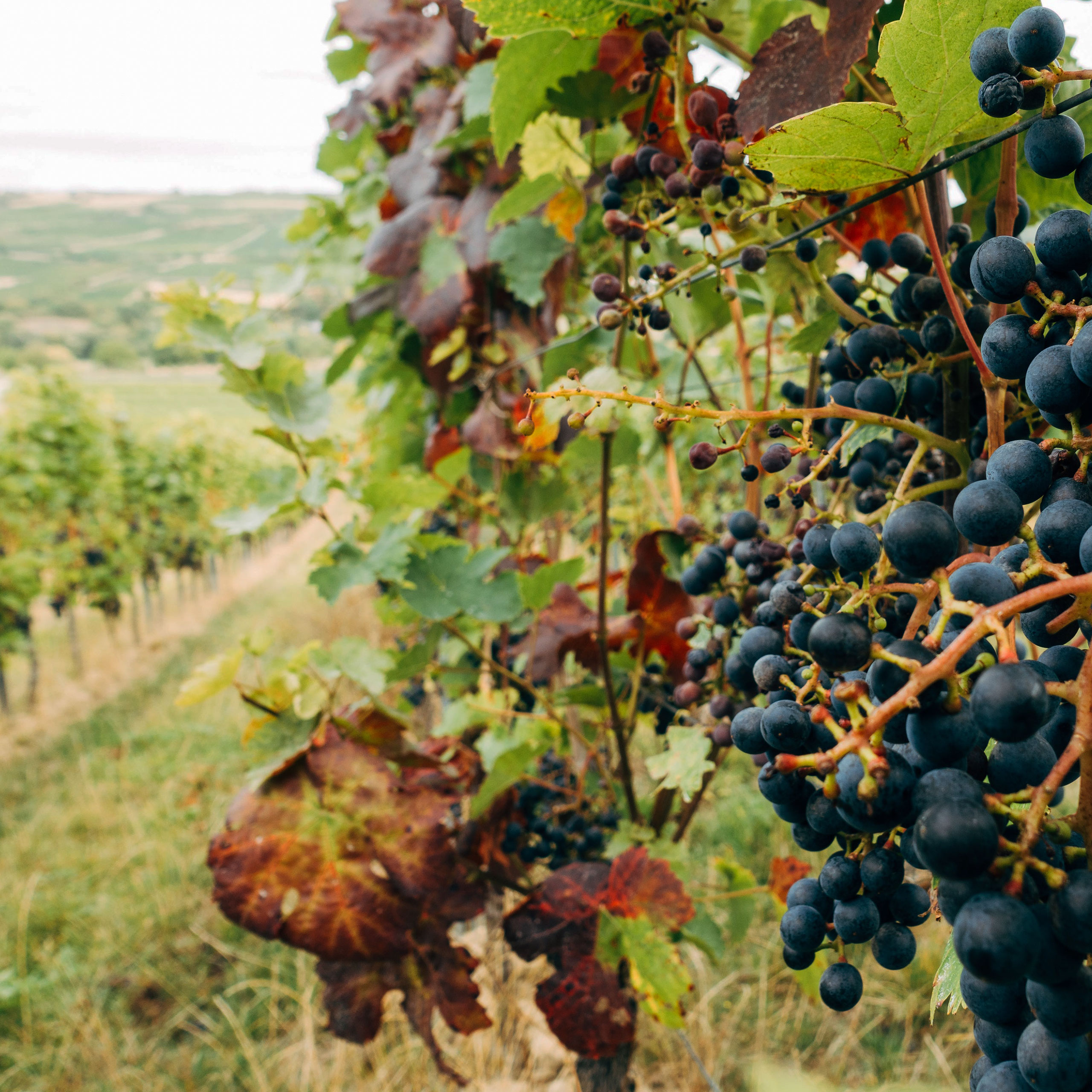
Wine and terroir
This concept combines elements representing the terroir of the vineyard. The heraldry for heritage, a bottle and a glass of wine, the sun as an essential element for the harvest, the leaf for the vine and nature, and finally water representing an essential element and the Rhône river.
Together, these elements create a modern form, rooted in the estate's heritage, which also evokes the biological process that takes place each year in the vineyards.
Typography
Logo Font: The Seasons Bold
Basic Sans Regular
A B C D E F G H I J K L M N O P Q R S T U V W X Y Z
a b c d e f g h i j k l m n o p q r s t u v w x y z
Challenges
The main challenge was to strike the right balance between tradition and modernity. The identity had to feel rooted and legitimate, without appearing dated or nostalgic.
Another key challenge was scalability: designing a visual system flexible enough to adapt across print and digital media, while maintaining a strong and recognizable brand presence.
Finally, the project required a refined aesthetic capable of standing alongside prestigious wine appellations, without excess — letting simplicity, detail and intention do the work.
Colors & Material
Light Sienna
#B17457
Green Spring
#AAB396
Golden Beige
#E4C59E
Old Lace
#FFF8E8
Dark Charcoal
#242424
White
#FFFFFF
Label Design Challenges
The label design was a central moment in shaping the identity of Clos des Saints. The goal was to step away from conventional wine codes and create a modern, restrained system built around the logo symbol. Acting as both designer and creative partner, I explored more than ten visual directions, experimenting with typography, layout, color and imagery—from graphic interpretations of the mark to photographic references to the estate.
The final labels balance heritage and modernity, using clarity, proportion and negative space to express elegance, authenticity and a contemporary vision of southern French wine.
Labels Exploration


Website Strategy & Direction
The website was conceived as both a brand showcase and a long-term e-commerce foundation. Its primary role is to introduce Clos des Saints, highlight its appellations, and express the winemaker’s commitment to the land and to vinification. From the early stages of the project, it was clear that the platform would also need to support direct-to-consumer sales in the medium term. Shopify was therefore selected as the CMS, offering a flexible and scalable solution for product, order and stock management while allowing the business to grow organically.
The design process began with an extensive benchmark of wine estate websites to identify best practices, recurring patterns and common shortcomings. In an industry often constrained by traditional and sometimes dated visual codes—particularly in Europe—the research helped define a more contemporary direction, inspired by a limited number of modern references where imagery, simplicity and storytelling were central.
Information Architecture
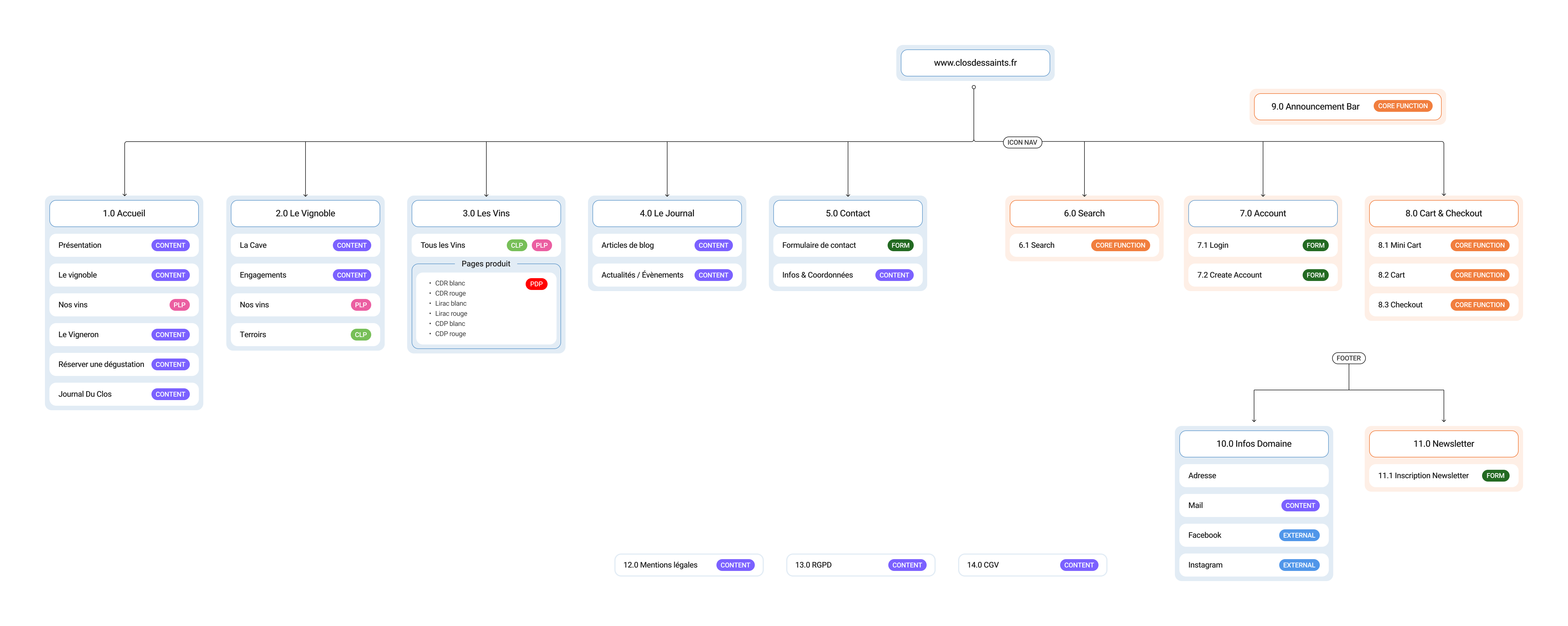
Design & process
Building on these insights, the visual approach was structured around strong use of color, large visual sections and a calm, editorial rhythm. Natural imagery takes a leading role, supported by a clear and restrained information architecture designed to keep navigation intuitive and focused. The site structure was intentionally reduced to essentials, ensuring continuity across pages and a seamless user flow. The site architecture was designed around intuitive navigation and a clear user journey.
Visual Design
Homepage & Product Pages
The homepage acts as the primary orientation point, immediately setting the tone while giving users quick access to the estate, its appellations and the winemaker. From there, the structure guides exploration in a logical flow: The Vineyard provides depth through history, terroir and environmental commitment; The Wines functions as both a discovery and conversion space, leading directly to product pages; The Journal supports ongoing engagement through news and events; and the contact page offers a direct, accessible point of interaction. Each page was designed to reduce friction, reinforce storytelling and support both exploration and purchase.
Particular attention was given to product pages, which play a key role in wine storytelling: beyond purchase, they provide detailed tasting notes, appellation context, grape varieties, serving advice and food pairings. Each product template was designed to be modular and easily updatable by the client, combining visual impact with clarity and long-term usability.

All Pages


Explore More
Explore More
Explore More
Explore More
David’s Tea
David’s Tea

UHG Spark App