Hilo App
What we did
Industry
Smart Home Service
Tools
Figma
Maze.co
Year
2021 – 2022
Overview
Hilo is a Hydro-Québec startup that combines free smart home devices with an intelligent energy management service designed to reduce household electricity consumption by up to 20% during winter. The Hilo mobile app serves as the central control hub, allowing users to manage connected devices remotely, monitor real-time energy usage, and configure automated behaviors during peak demand events.
Enrollment in Hilo automatically grants access to best electricity pricing, with lower winter rates outside of peak events. To fully benefit from this pricing model, users must actively reduce consumption during those peak periods. The app’s challenge system plays a critical role in driving this behavior by making energy reduction goals explicit, measurable, and actionable through automation and clear feedback.


I joined Hilo’s Residential team in March 2021 at a pivotal moment, as the company transitioned the design of its mobile app from agency-led work back in-house, following its initial development by LG2. My role focused on strengthening the app’s user experience by designing and integrating new features, while ensuring visual and interaction consistency across the product.
Working closely with product and engineering teams, I helped evolve the app into a more robust, scalable platform, balancing innovation with continuity to preserve the integrity of the existing design system.
01. Product UX & UI Design
Building on insights from the previous season, the Product UX & UI design focused on validating key assumptions, identifying friction points, and iteratively refining the interfaces. The goal was to assess users’ experience and overall understanding of the Challenges section, ensuring the design clearly supported decision-making, comprehension, and successful participation.
02. Interactive Prototyping for Unmoderated User Testing
We designed targeted test scenarios and interactive prototypes to support unmoderated remote user testing with Maze, focusing on the core functionalities of the new interfaces. This approach allowed us to validate user comprehension, assess key interaction flows, and identify friction points early, ensuring design decisions were grounded in real user behavior before finalizing the experience.
03. Testing Results Analysis and Design Iterations
Once a sufficient number of users had completed the tests, we analyzed the results to validate design assumptions, surface recurring pain points, and identify sources of friction. These insights directly informed iterative refinements to the interfaces, ensuring the final experience was both intuitive and aligned with user expectations and product goals.
Evolving « Challenges » Sections
Objectives
The first project focused on evolving the “Challenges” experience for the 2021–2022 season, building on learnings from the previous year to improve clarity, usability, and behavioral impact. The primary objective was to ensure users clearly understood how challenges worked, how success was measured, and how their actions translated into tangible savings and rewards.
From a product perspective, the work aimed to reduce friction in key user actions: interpreting consumption data, understanding challenge outcomes, adjusting participation modes, and managing device inclusion during challenges and preheating phases. UX wireframes, UI design, interactive prototypes, and remote unmoderated testing (Maze) were leveraged to validate comprehension, surface usability gaps, and inform iterative design decisions.
Challenges
A central challenge was aligning a complex energy pricing and demand-response model with a user experience that felt simple, predictable, and trustworthy. Users needed to quickly grasp when and why to reduce consumption, understand real-time performance against challenge targets, and feel confident that automation was working in their best interest.
Another challenge was balancing system flexibility with cognitive simplicity. Offering granular control over participation and device management was essential for power users, but risked overwhelming others. The design solution required careful prioritization of information, progressive disclosure, and clear visual feedback—ensuring the challenge experience supported both user autonomy and large-scale energy reduction goals.
Wireframing and Design Process
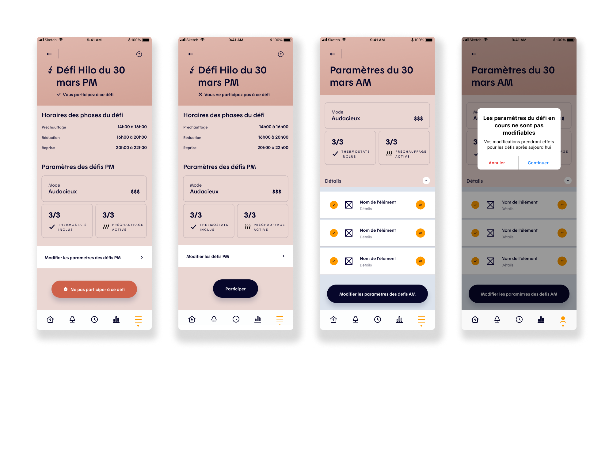
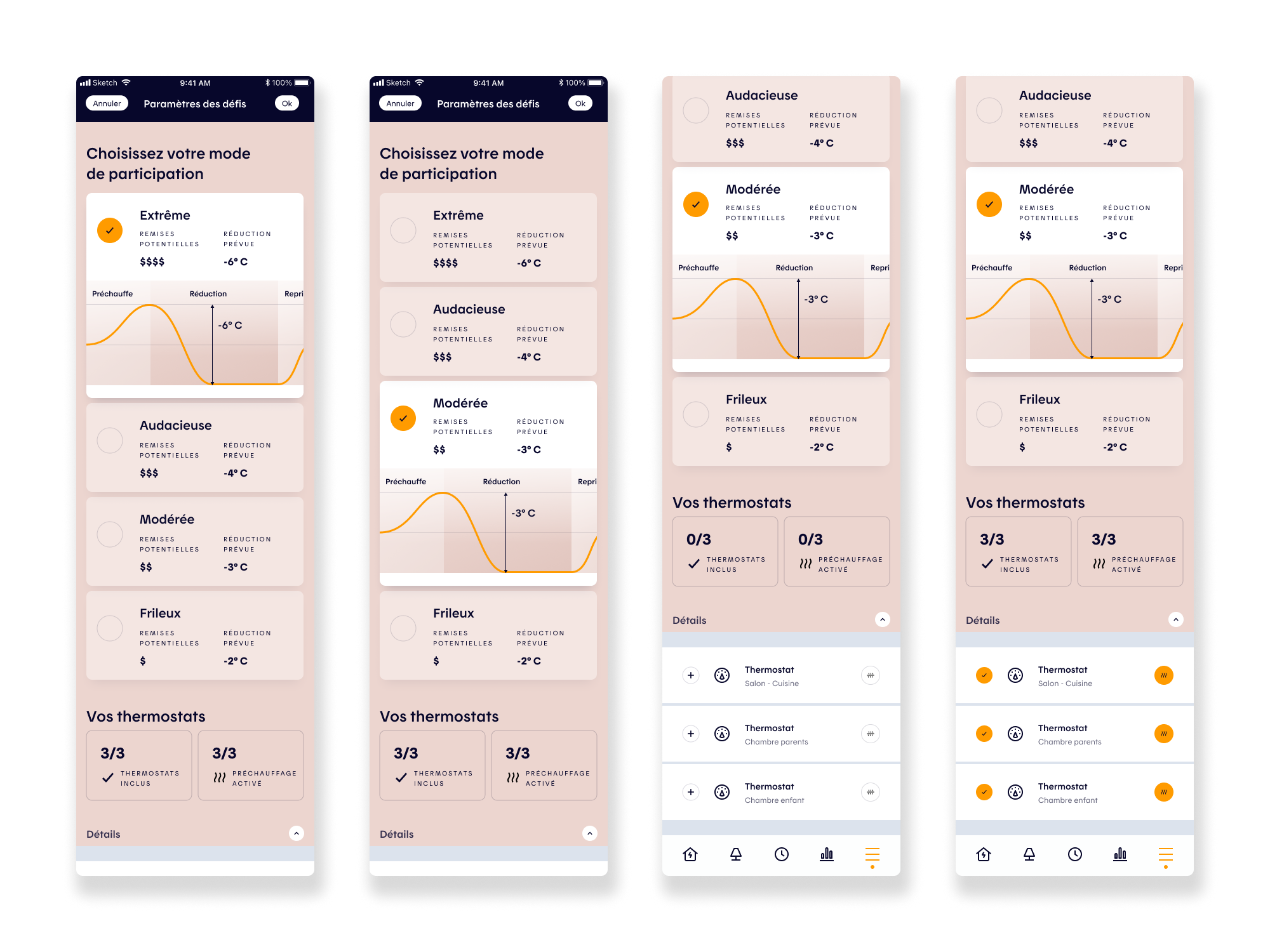
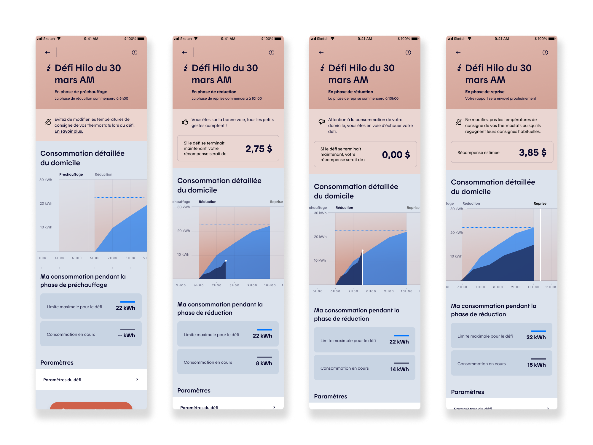
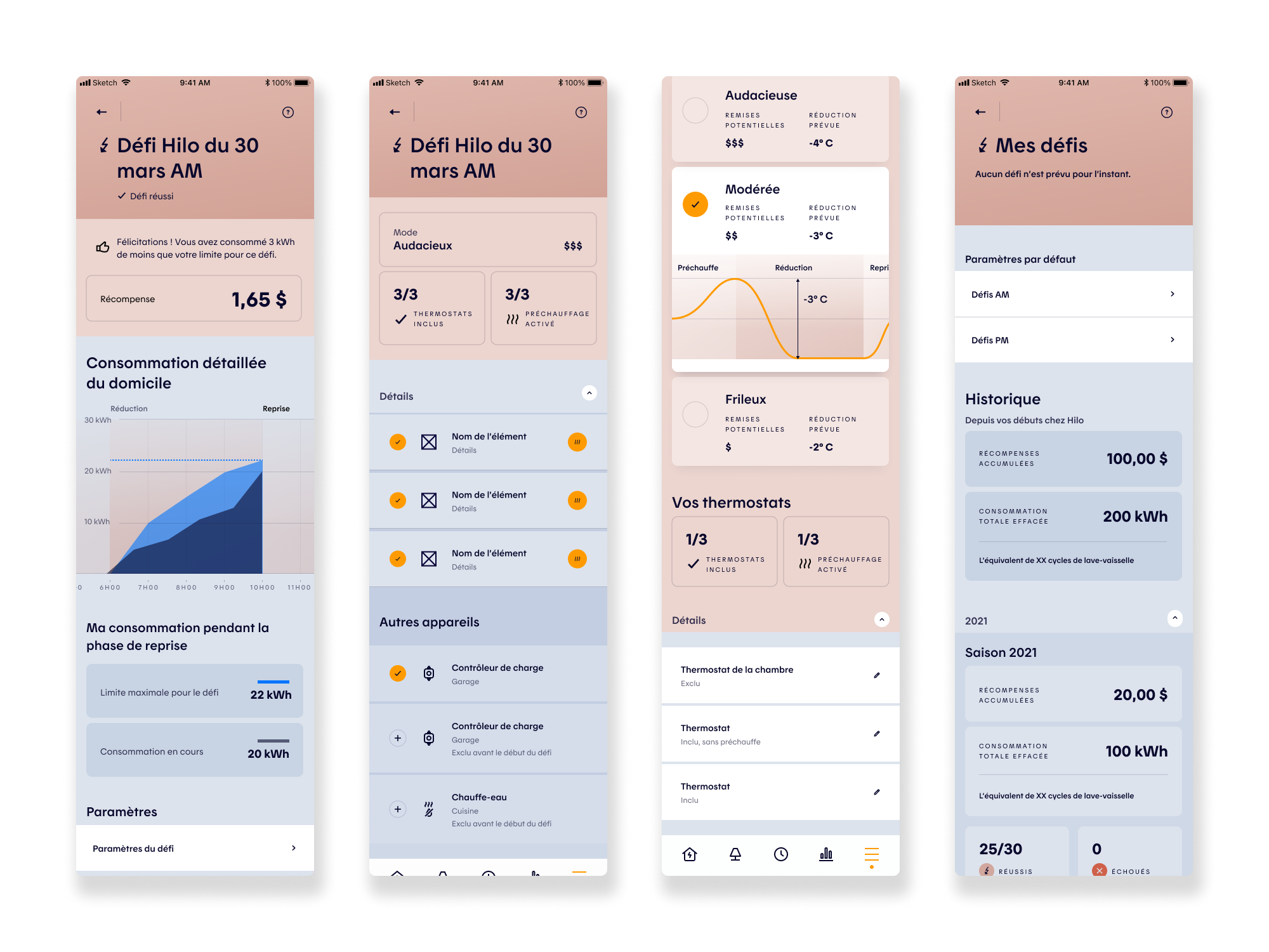
After multiple wireframe iterations, the Challenges experience was reworked to better support user decision-making and control. Improvements included clearer participation levels (Extreme, Bold, Medium, Easy), expanded device management (EV charging stations, water heaters), granular room and device selection, and improved visibility into completed and failed challenges. The experience also introduced clearer tracking of real-time energy consumption during a challenge, along with associated rewards. To validate these design decisions, we tested key assumptions through user flows and usability testing, ensuring the experience was intuitive, coherent, and free of unnecessary friction while supporting both user confidence and product goals.
User Testing Scenarios
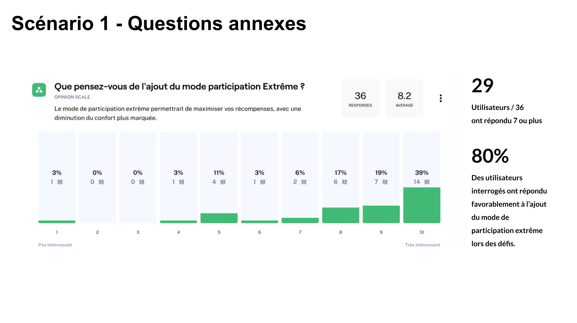
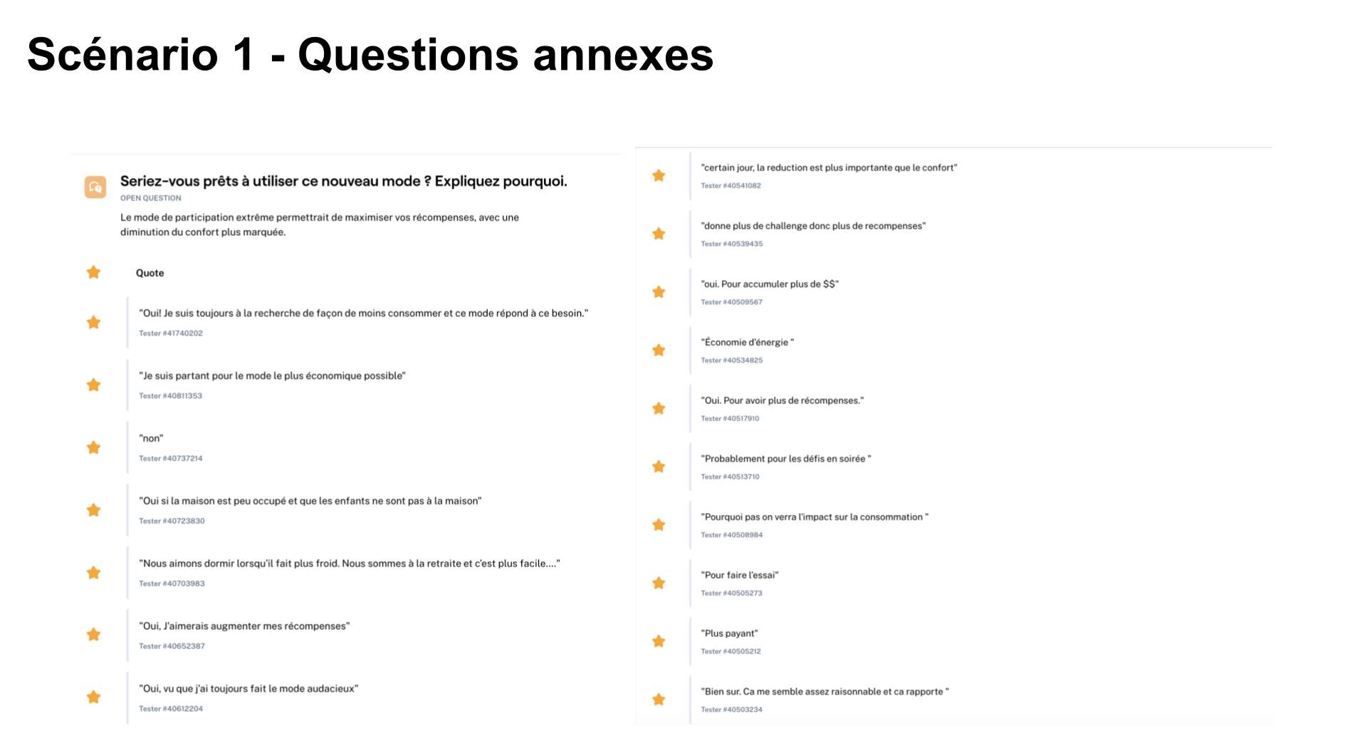
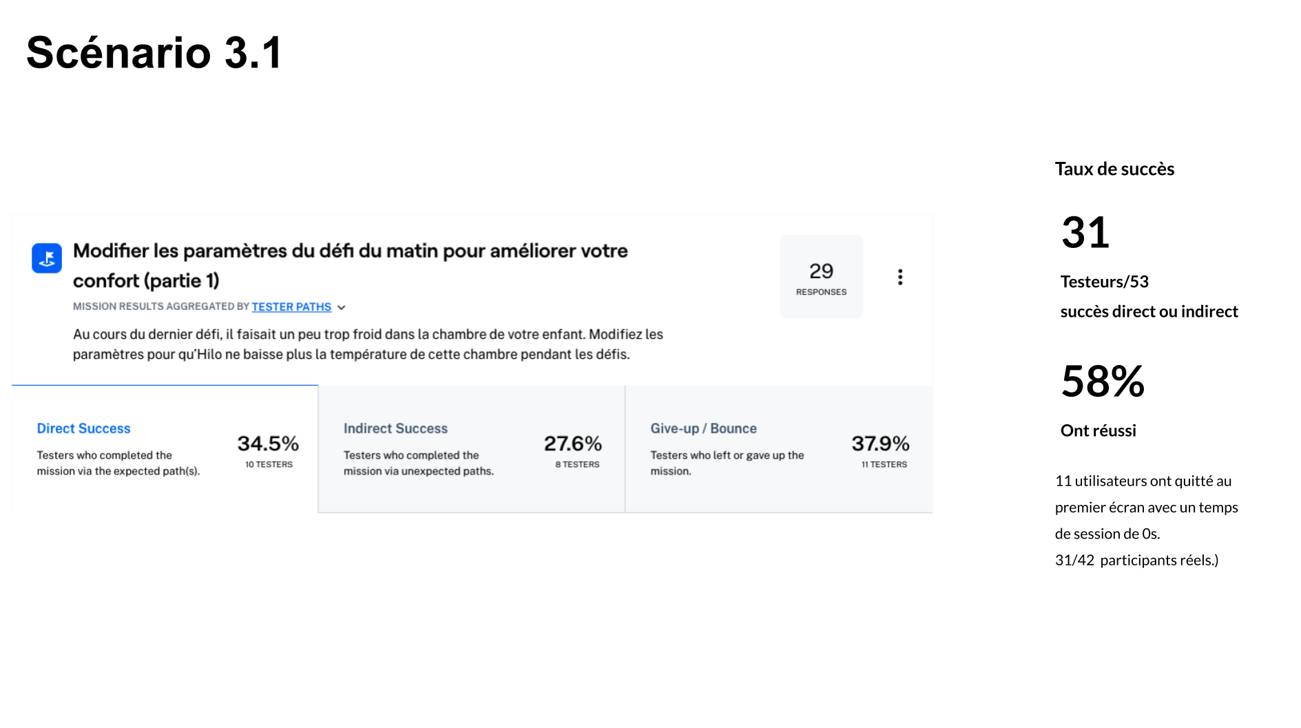
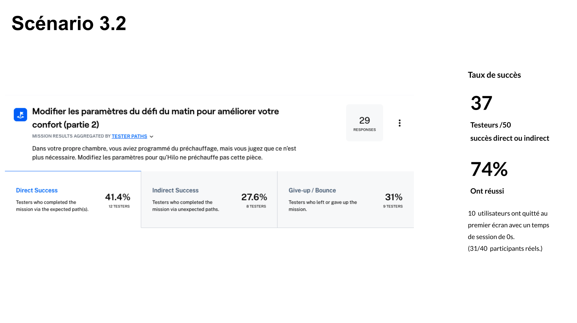
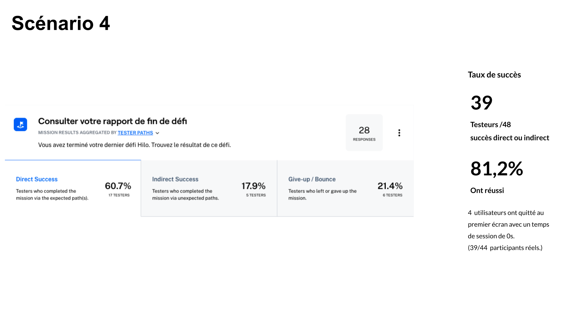
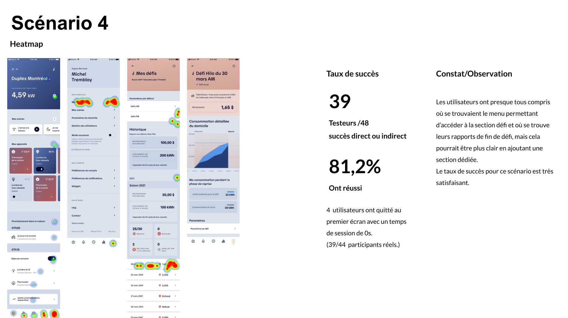
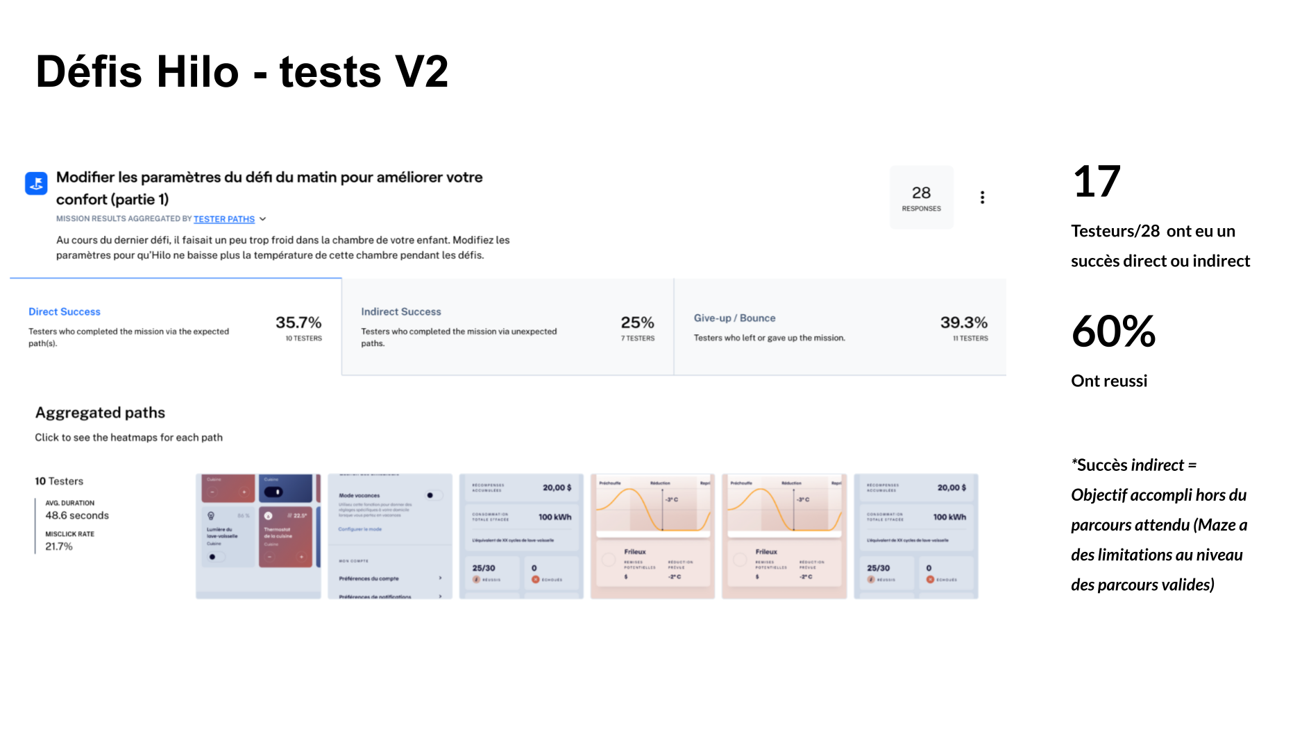
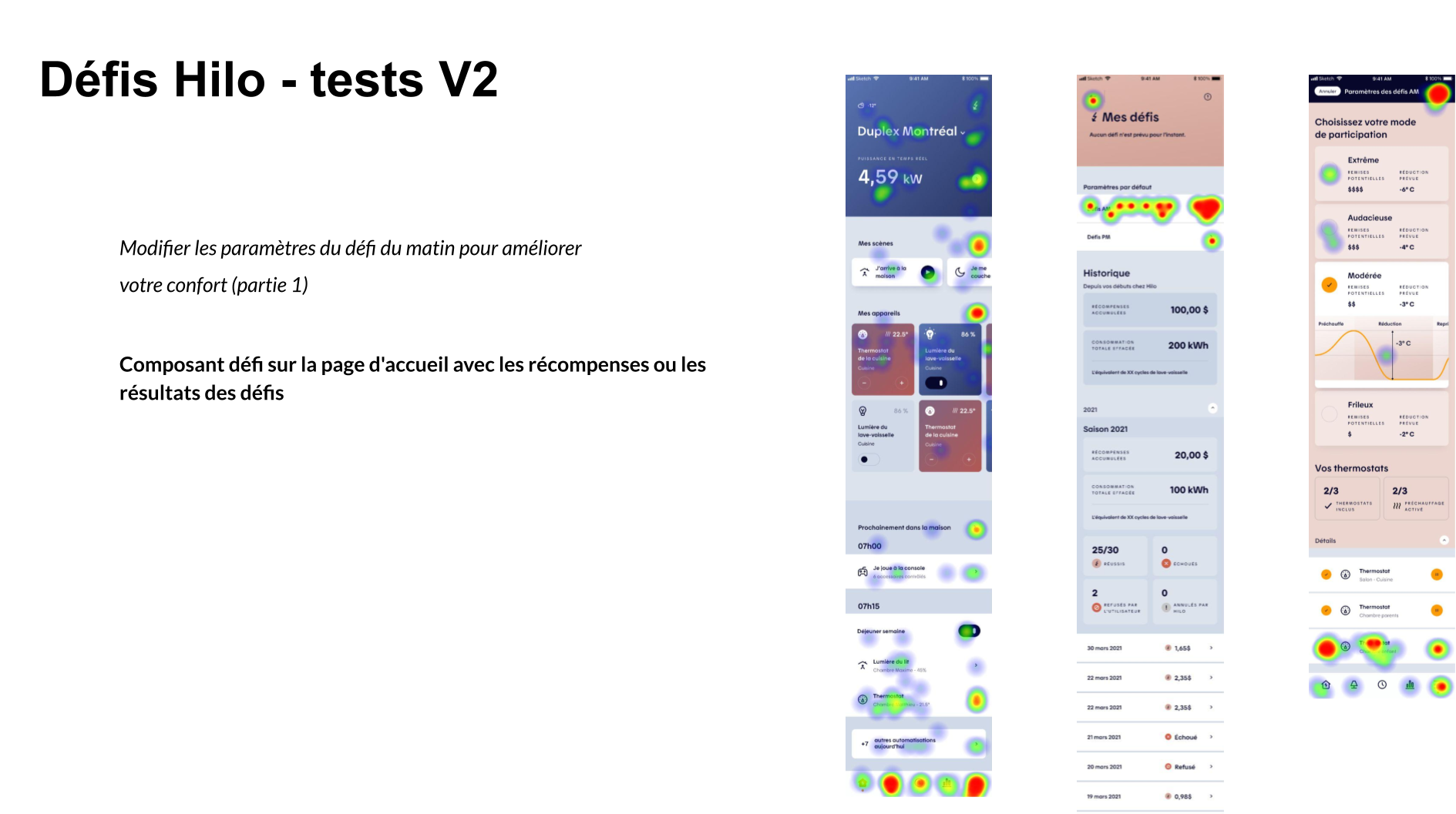
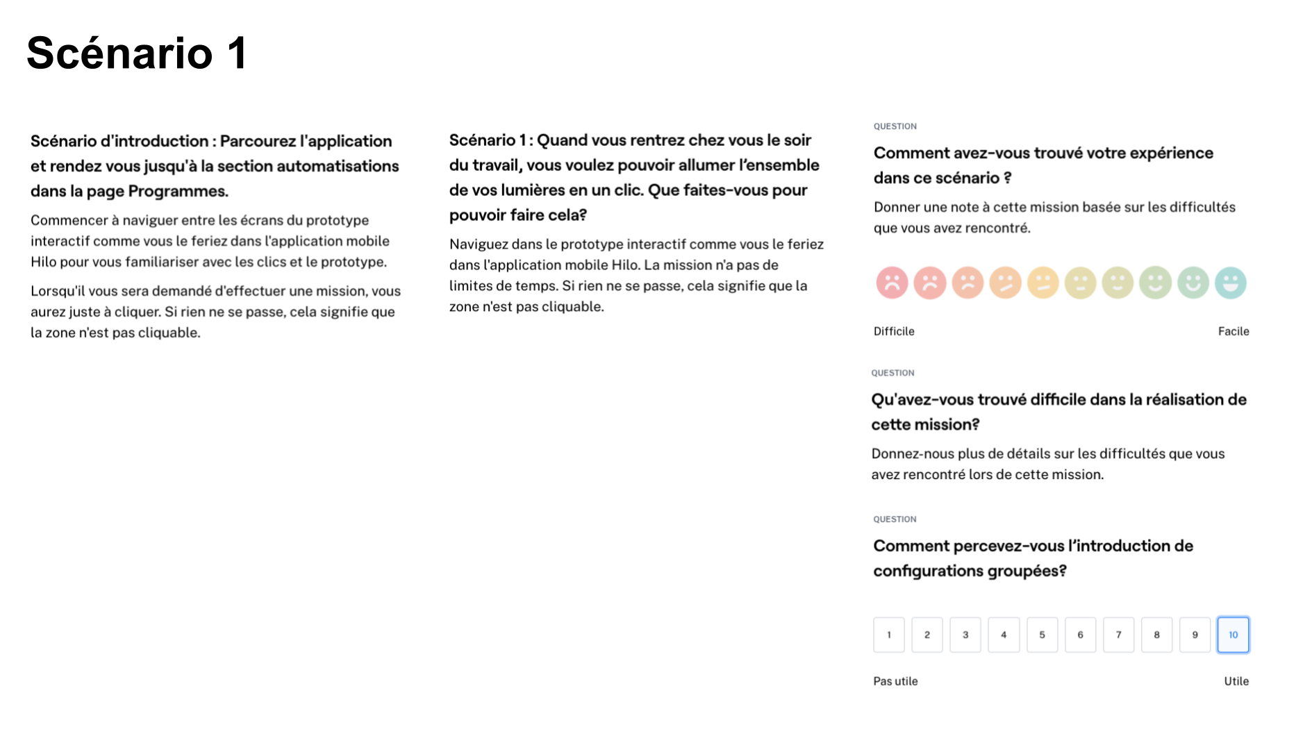
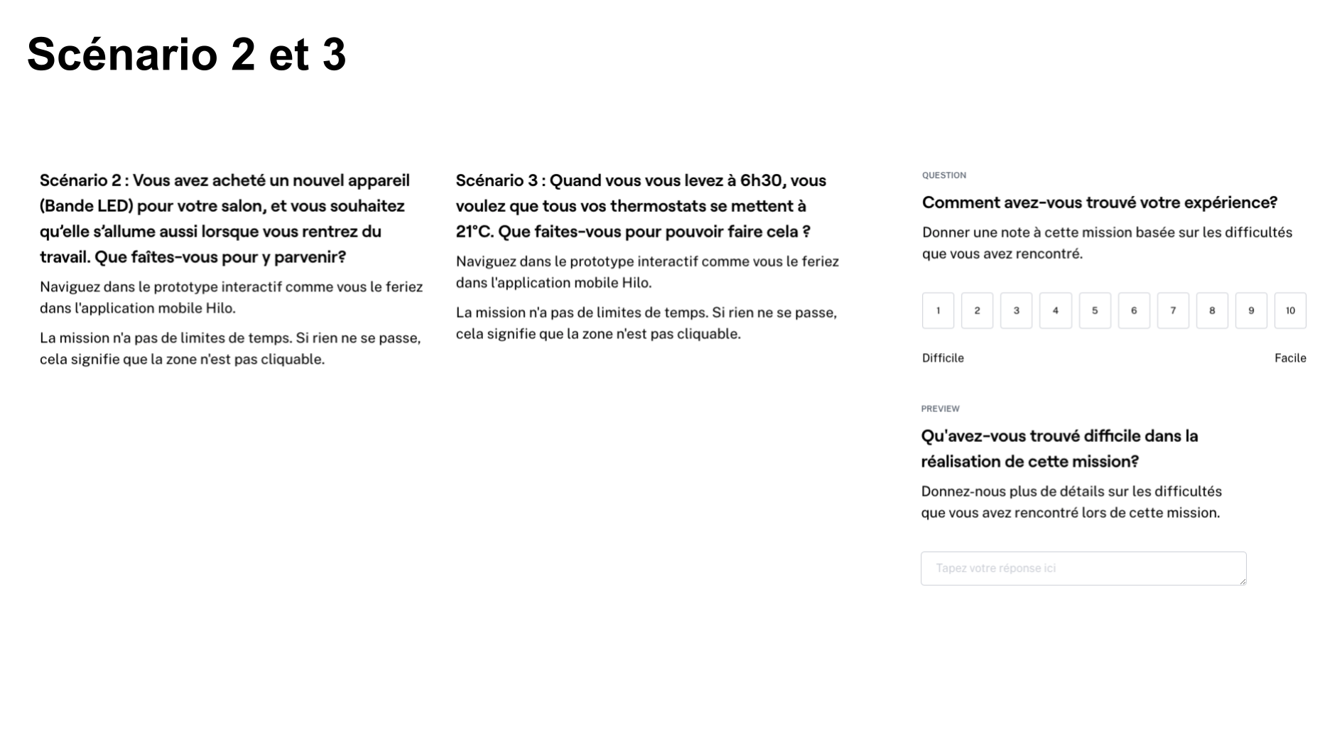
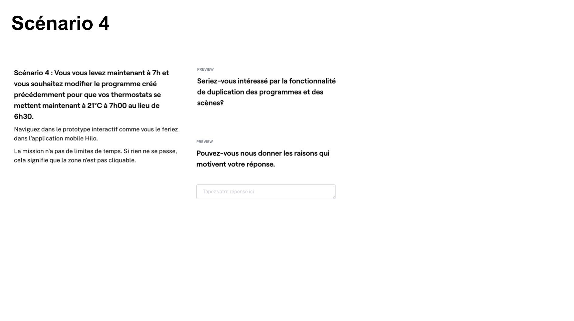
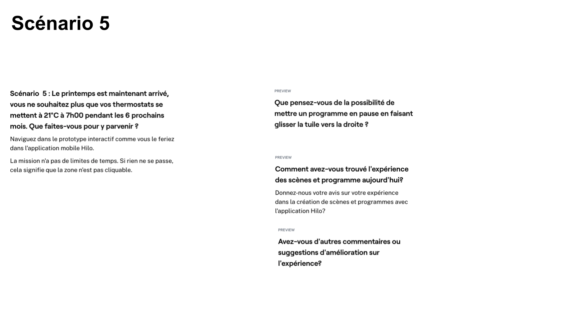
We designed four task-based scenarios supported by interactive prototypes and tested them with real users through unmoderated sessions on Maze. The tests focused on ensuring a clear understanding of how challenges functioned end to end, how rewards are calculated, why outcomes may vary despite identical settings, and what drives success or failure during a challenge. Particular attention was given to validating comprehension of the consumption baseline, the challenge duration, and the role of user behavior throughout the event. We also confirmed that users understood which devices should remain active, that rewards are based on whole-home consumption, and that only energy usage during the reduction phase is considered—informing whether additional educational support, such as an FAQ, was necessary.
Testing Method
- Unmoderated
- Remote
Collection period
- Two sessions
- 9 – 15 June 2021
Duration
- 15-20 Minutes
Sample Size
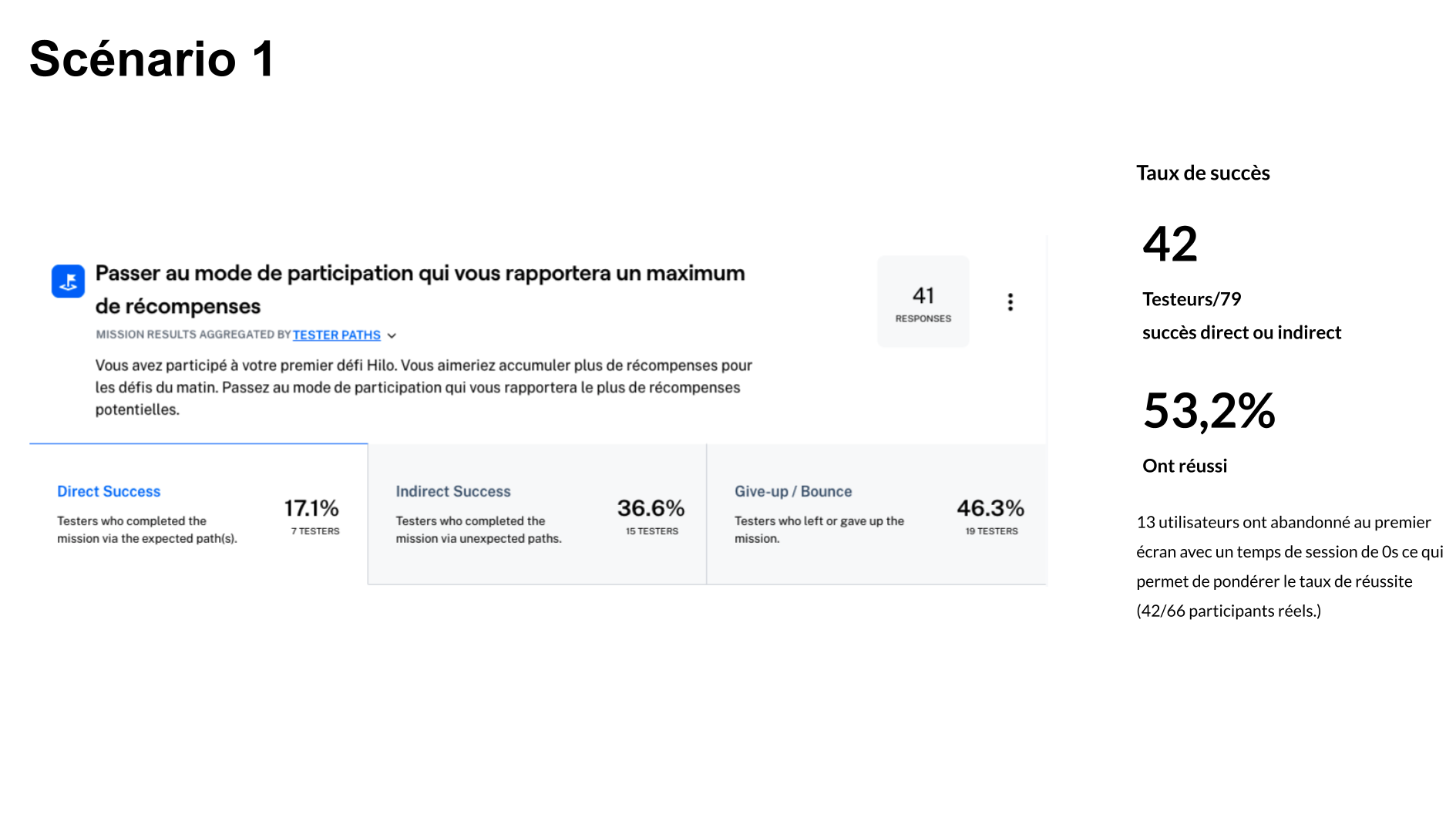
78 participants/testers


")
")
")
")
")
")
")
")
")
")
")
")

")
")
User Testing Outcome
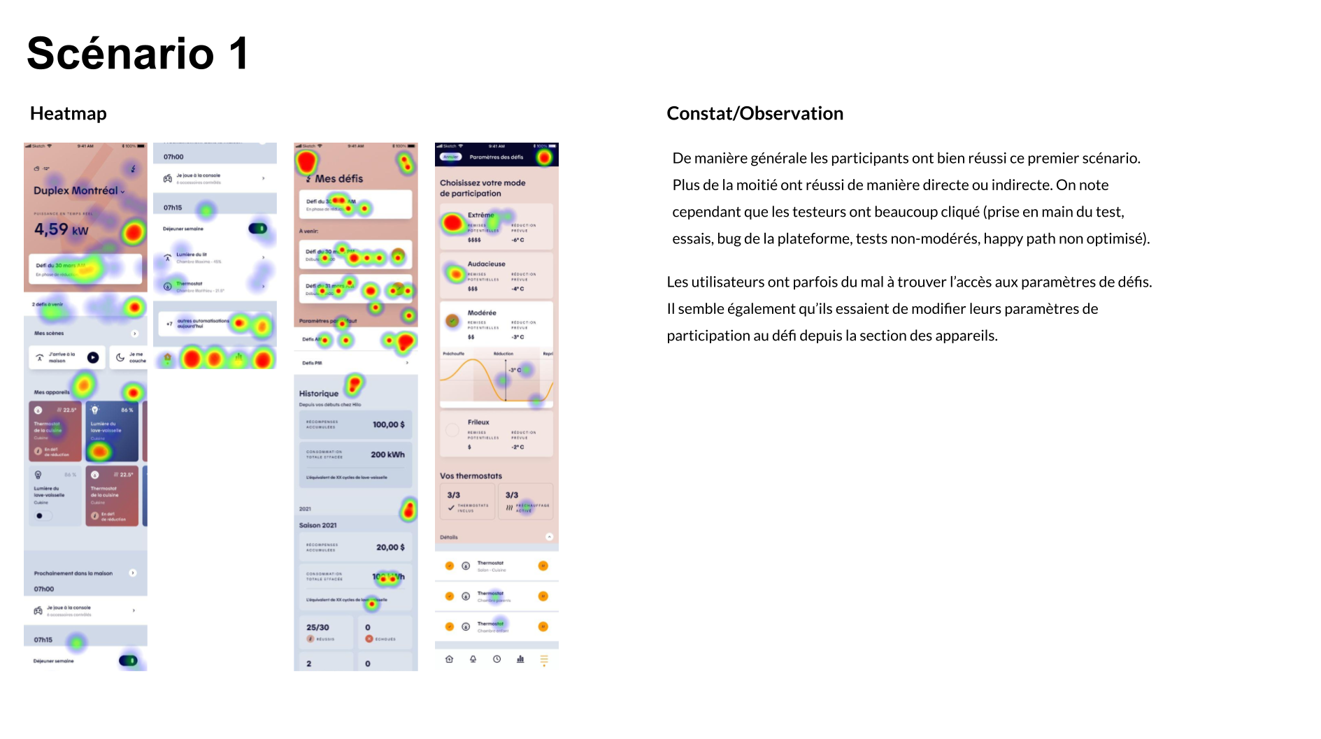
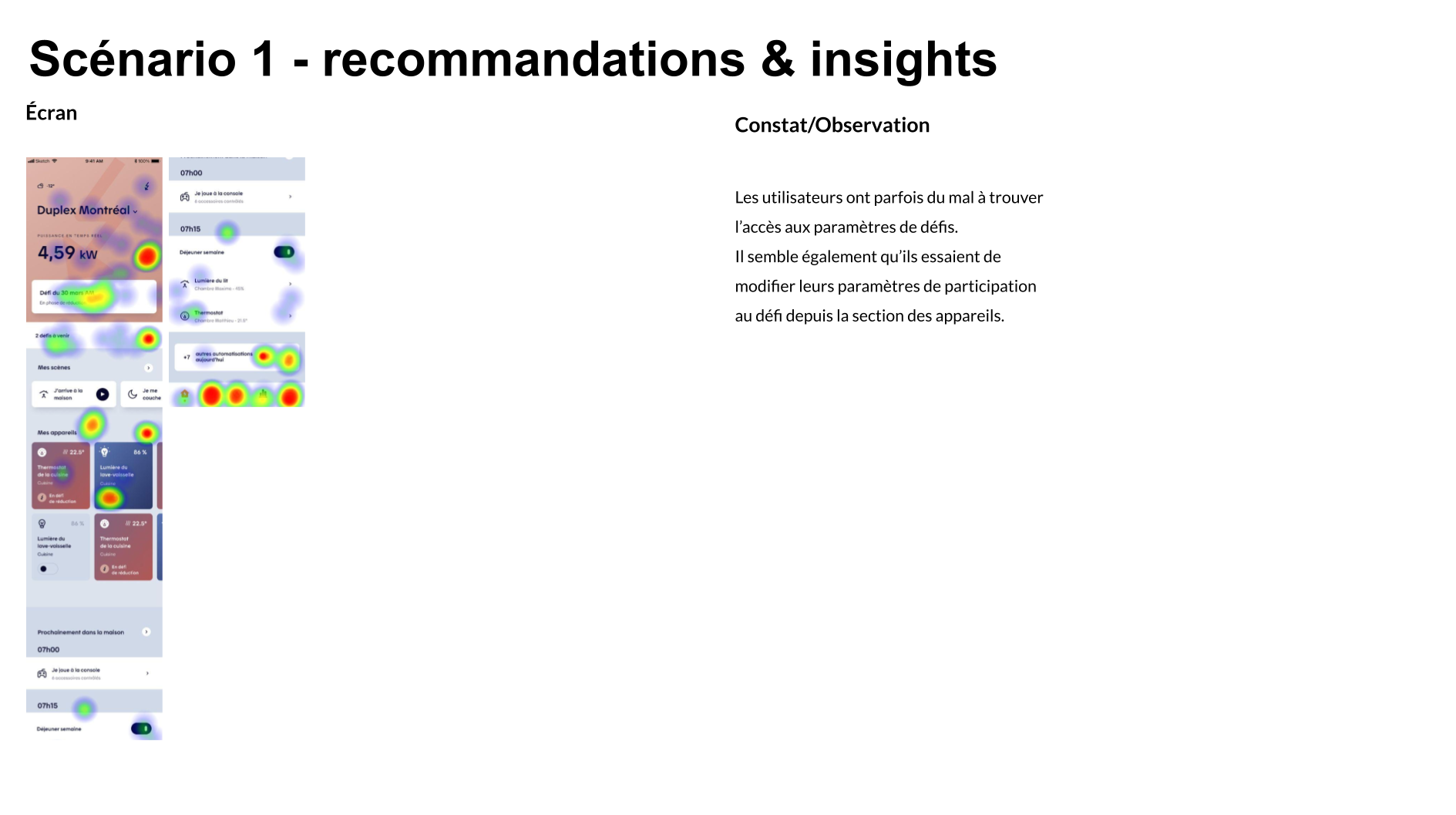
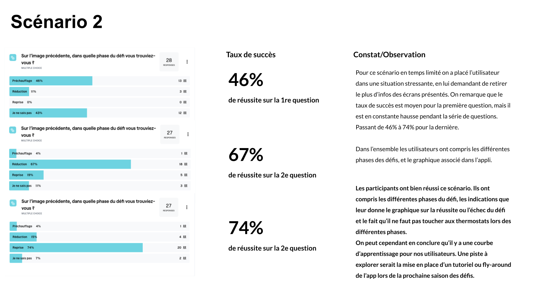
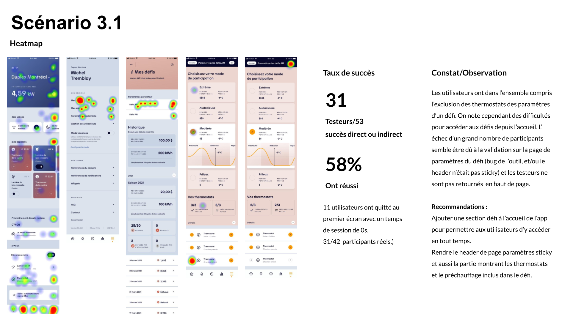
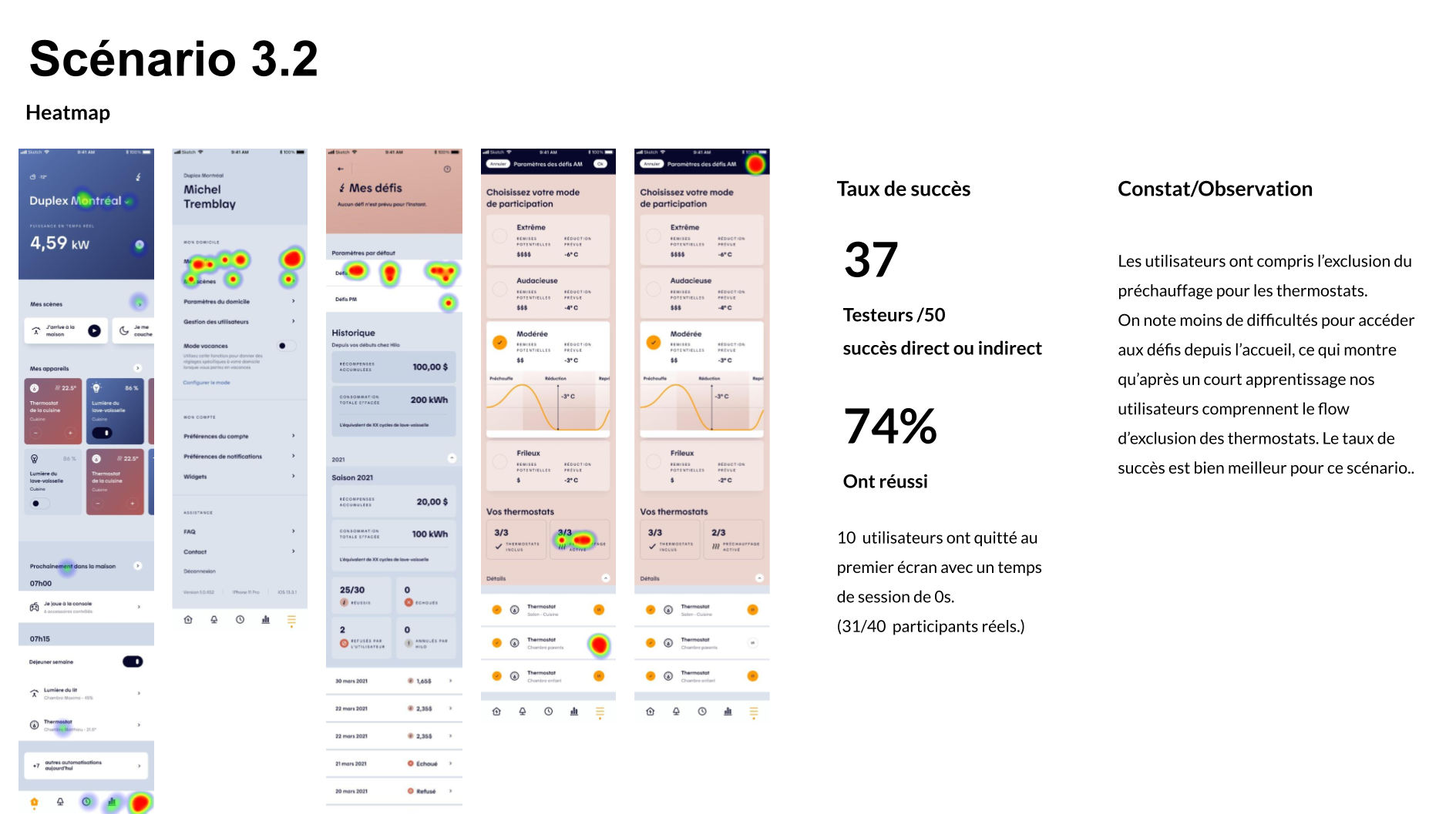
Overall, user testing confirmed that most users understood how challenges worked and could navigate the flow easily, but also revealed opportunities to further simplify the experience and reduce the learning curve.
Both unmoderated test sessions were well received by participants, with a total of 97 external users taking part across the two rounds. Results highlighted an initial learning curve within the Challenges section, an expected outcome given the unmoderated format, where users had to navigate incomplete states, non-clickable elements, and minor bugs that could introduce friction or early drop-off.
Between the two sessions, rapid iterations were implemented, including key navigation adjustments such as replacing the profile icon with a hamburger menu. These quick wins led to a clear improvement in usability metrics and task success rates in the second round, validating the effectiveness of an iterative, test-and-learn approach.
The results surfaced clear, actionable insights that informed the next design iterations. These insights laid the foundation for further iteration, with a more comprehensive synthesis shared in subsequent reviews.
Easing the Learning Curve
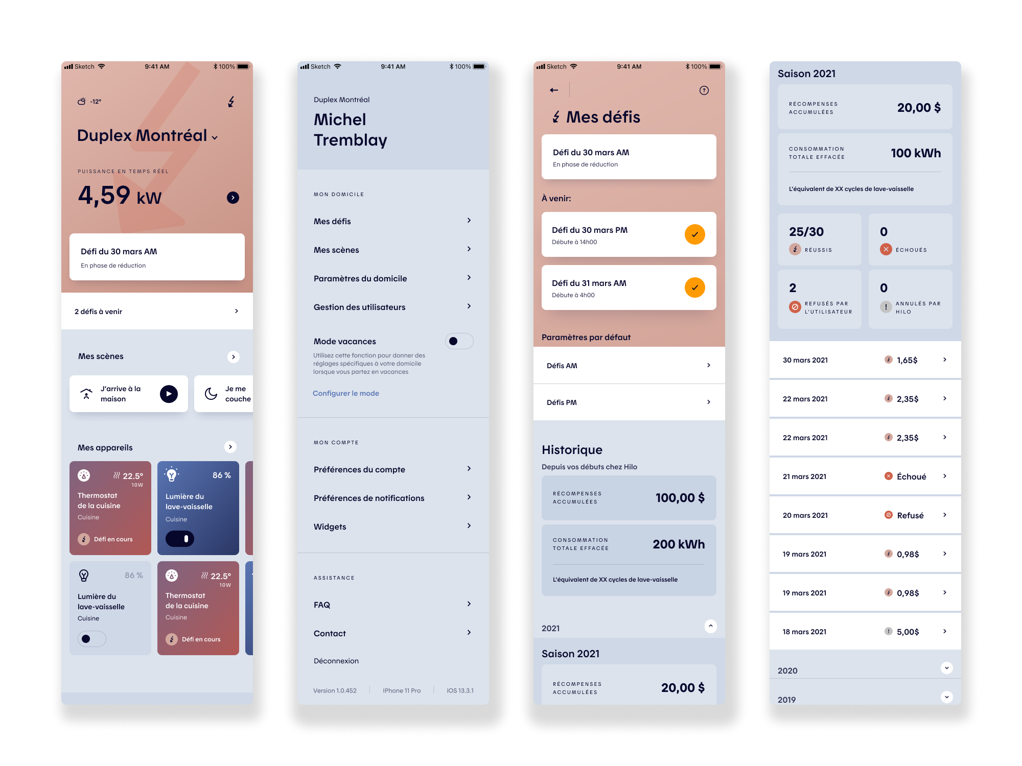
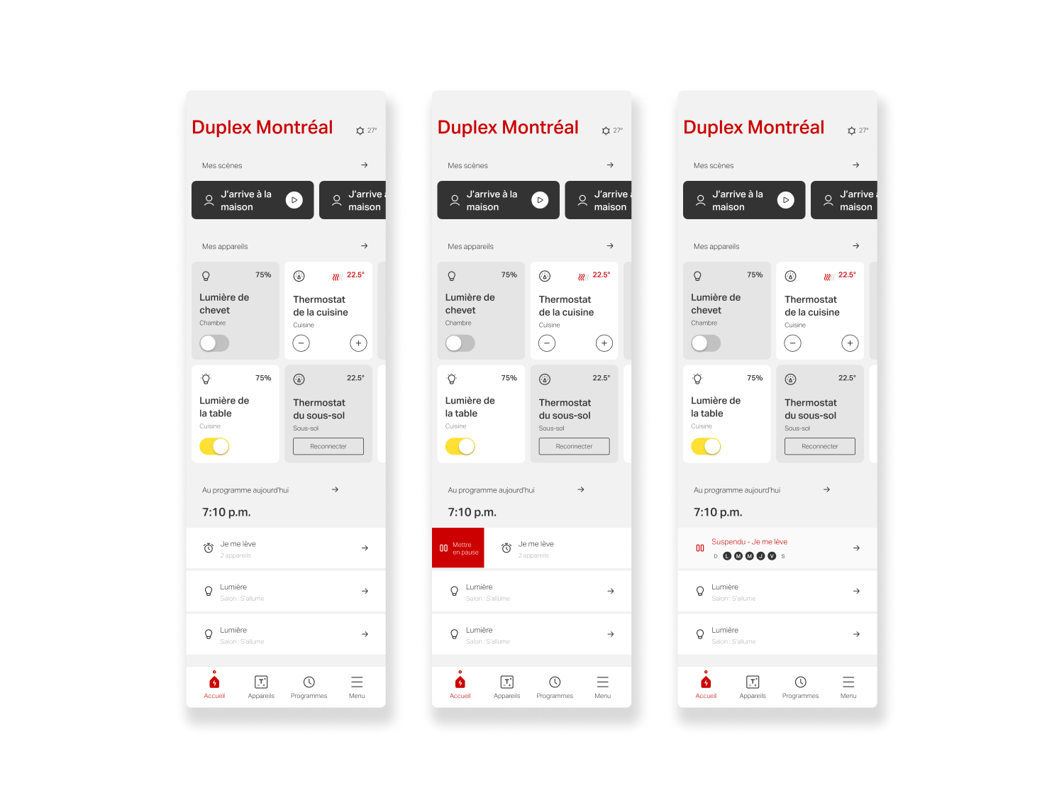
Key recommendations focused on introducing lightweight onboarding and in-context guidance at moments of action to better support comprehension of the UI. From a product and usability standpoint, improvements included reducing the visual weight of the home header to prioritize faster access to device controls, relocating real-time power data to the Consumption section, and surfacing a dedicated Challenges module on the home screen to highlight upcoming events and accumulated rewards when relevant.
UI Refinements
Navigation and interaction refinements were also proposed, such as replacing the profile icon with a hamburger menu, adding labels to the navigation bar to support new users, increasing tap targets across the app to reduce misclicks, and introducing toaster notifications to provide clear system feedback. Finally, access to challenge settings was streamlined by adding a secondary entry point directly within challenge screens, supported by usage tracking to inform long-term design decisions.


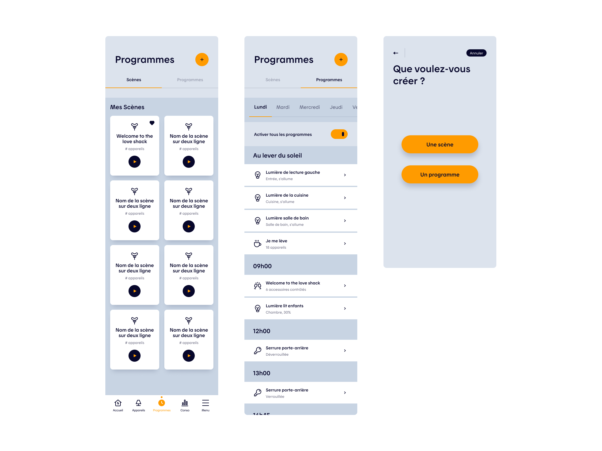
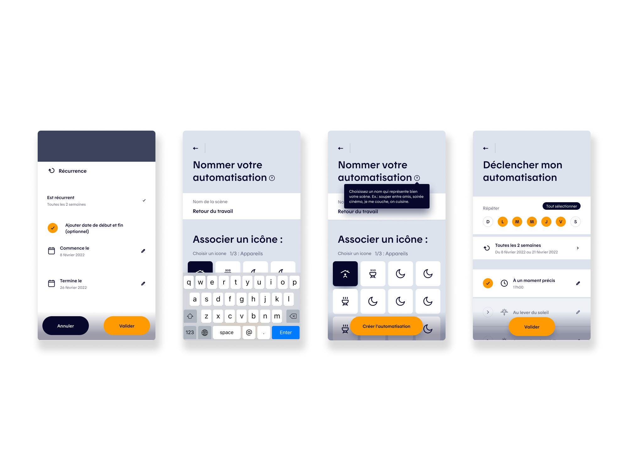
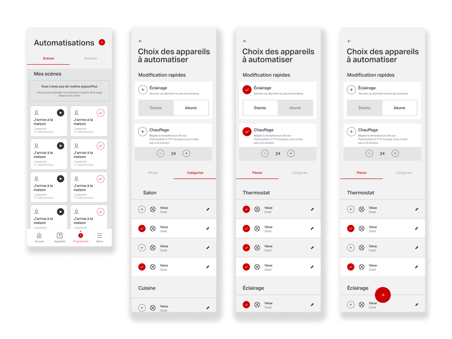
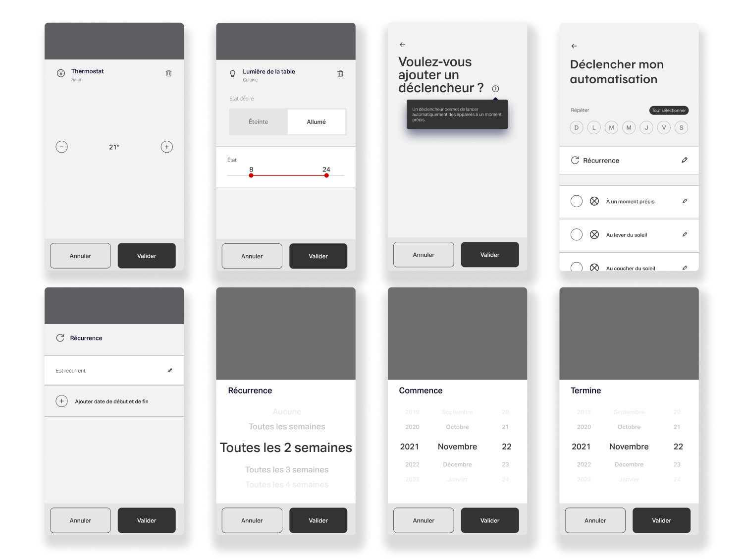
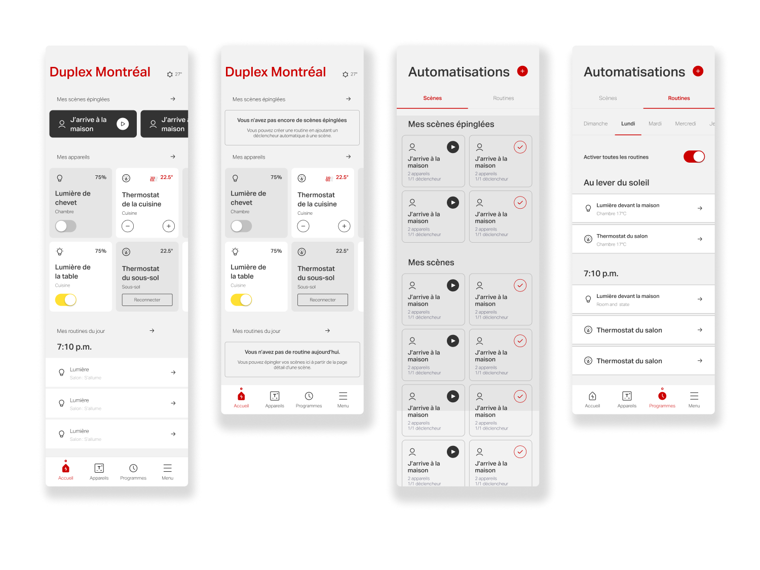
Evolving Scenes & Routines
Objectives
A second key project focused on evolving the app’s Scenes & Routines (Programs) experience, which enables users to automate actions across their connected devices, such as lighting, heating, and other smart systems. Routines allow users to define behaviors that trigger automatically based on time or context: lowering thermostats overnight and restoring comfort before wake-up, reducing heating and turning off lights when leaving home, or reactivating them upon return. They also support mood-based scenes, such as dimmed lighting for family dinners or movie nights.
While highly valuable from a product standpoint, this feature was initially perceived as complex and difficult to grasp. The objective was to simplify mental models, improve clarity, and make automation feel accessible, transforming a powerful but underutilized capability into an intuitive, everyday tool for users.
Challenges
The main challenge was scaling the Scenes & Routines experience with new features while preserving the app’s visual consistency and clarity. The goal was to give users greater control and more contextual information to tailor programs to their needs, without increasing complexity or breaking established patterns. This required extending the existing design system thoughtfully, introducing new components and interactions that felt native to the product, reinforced usability, and maintained a cohesive experience across the app.
Another key challenge was the need to design improvements that could scale beyond Hilo. With the exception of Hilo-specific Challenges, all updates to the Scenes & Routines experience had to be implemented both visually and functionally in the Allia app by Stelpro, which was being developed in parallel. This required designing flexible, system-driven solutions that could adapt to a different brand identity and UI language while maintaining consistent behaviors and interactions—reinforcing the importance of a robust, extensible design system across multiple products.
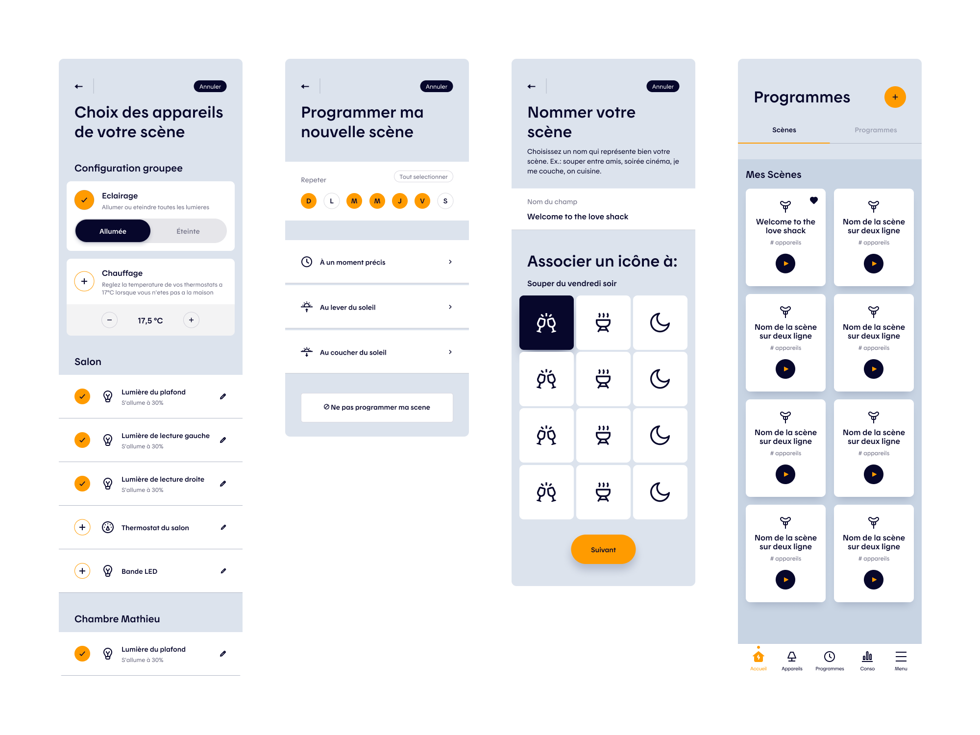
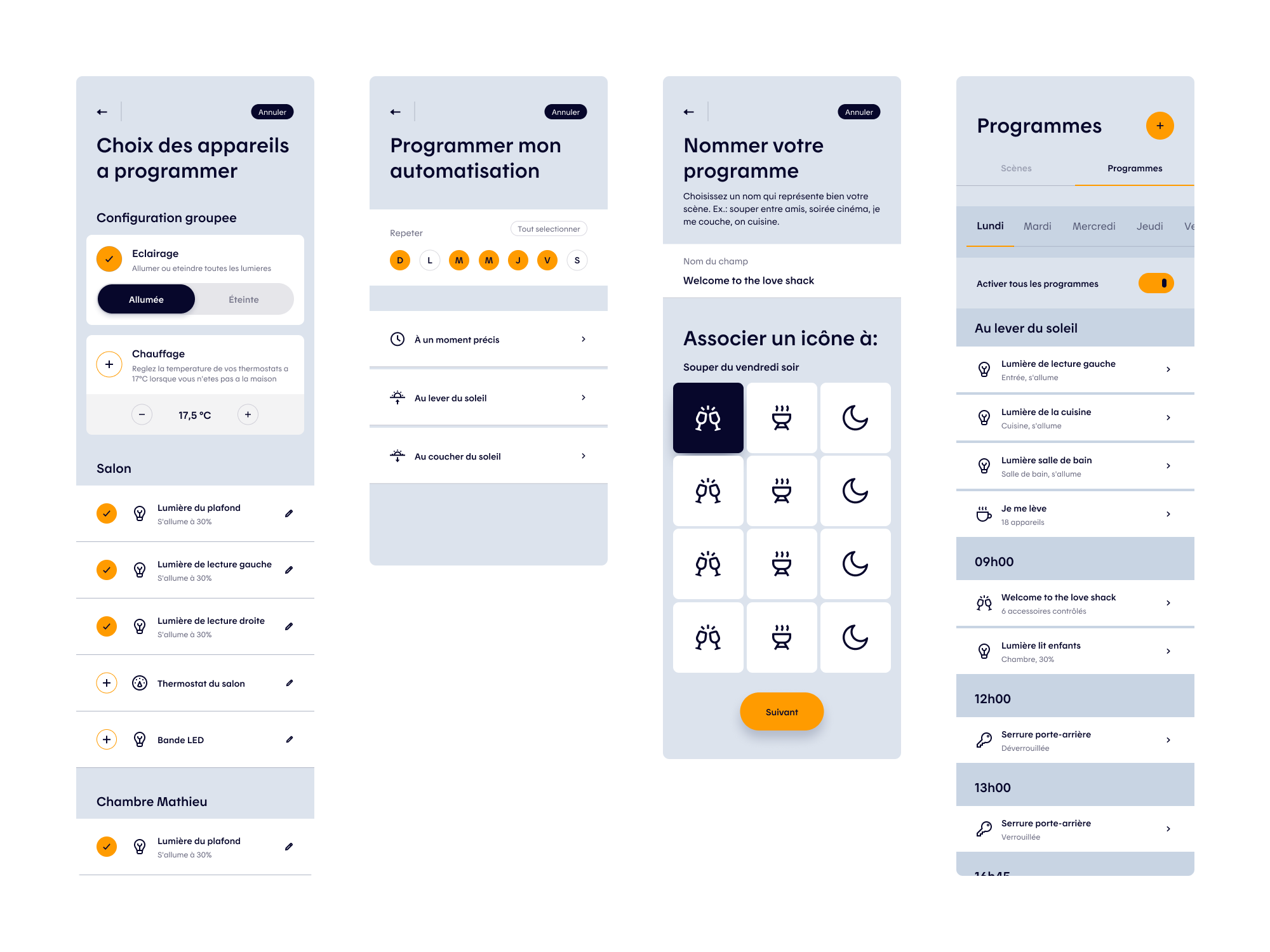
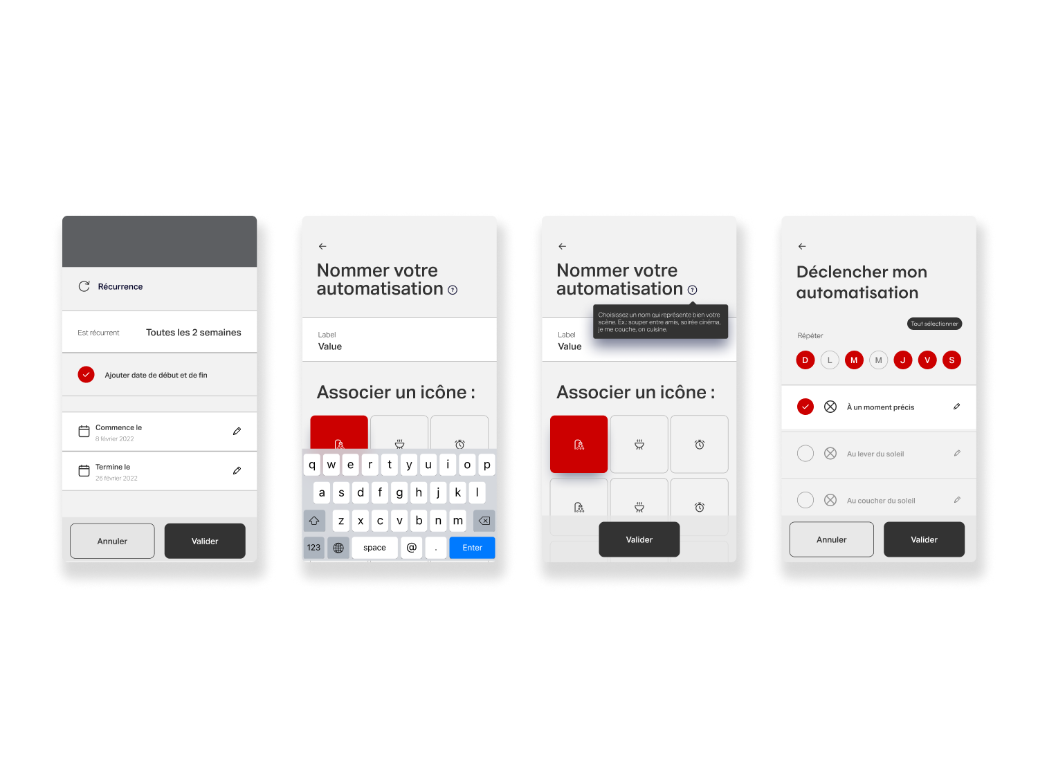
Programs and Scenes Creation Flow
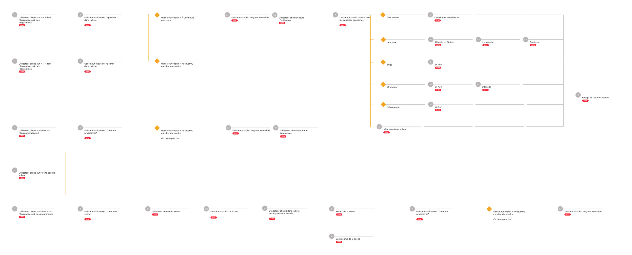
User Testing Scenarios
The Scenes & Routines experience was redesigned with a strong product lens, positioning automation as a key driver of engagement and energy optimization. The project began with an extensive benchmark of leading smart-home platforms, including Amazon Alexa, Google Nest, and Apple Home, which helped identify common patterns, best practices, and gaps in the existing Hilo experience.
This analysis highlighted inconsistencies across the industry, such as varying terminology for automation (automation, routines, programs), and informed a clearer, more coherent approach tailored to Hilo. Building on these insights, we simplified creation flows, clarified system logic, and reduced cognitive load while preserving advanced controls. Interactive prototypes and task-based scenarios were used to evaluate users’ ability to configure, understand, and trust automated behaviors.
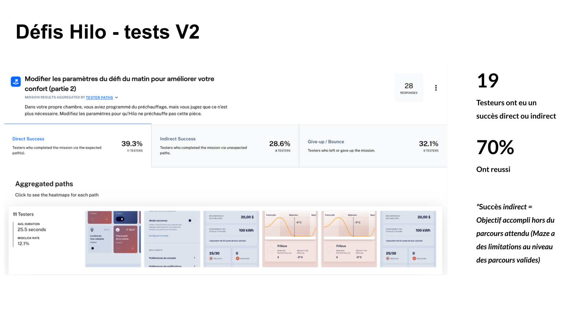
Unmoderated testing via Maze validated key assumptions, surfaced friction points, and measured task success. Scenarios assessed core actions, pausing programs, viewing device-linked routines, distinguishing scenes from schedules, as well as the clarity of the creation flow and adoption of new features such as duplication, editing, and scheduling existing scenes. Insights from testing directly informed iteration, resulting in a more intuitive, flexible, and scalable automation experience aligned with product goals.
Testing Method
- Unmoderated
- Remote
Collection period
- 1 session
- November 1st 2022
Duration
- 8-12 Minutes
Sample Size
47 participants/testers
")
")
")
")


User Testing Outcome
User testing outcomes for Scenes & Routines validated the direction toward a clearer, more system-driven automation experience. Results showed that users were able to understand and complete key tasks, such as creating scenes, scheduling programs, grouping configurations, and managing devices, with a higher level of confidence than in the previous experience. Areas of hesitation around advanced features and automation logic surfaced early, providing clear guidance on where clarity and guidance were needed to be reinforced.
Overall, the insights confirmed that simplifying structure, terminology, and interaction patterns effectively reduced cognitive load and improved usability. The redesigned experience made automation feel more accessible and trustworthy, supporting stronger adoption of a high-value feature while aligning with broader product and energy-optimization goals.
Clarifying Automation Logic
Testing showed that users benefited most from a clearer, more explicit automation model. Improving how scenes and grouped configurations were presented helped users better understand how and when actions would run, increasing confidence in setting up and relying on automation.
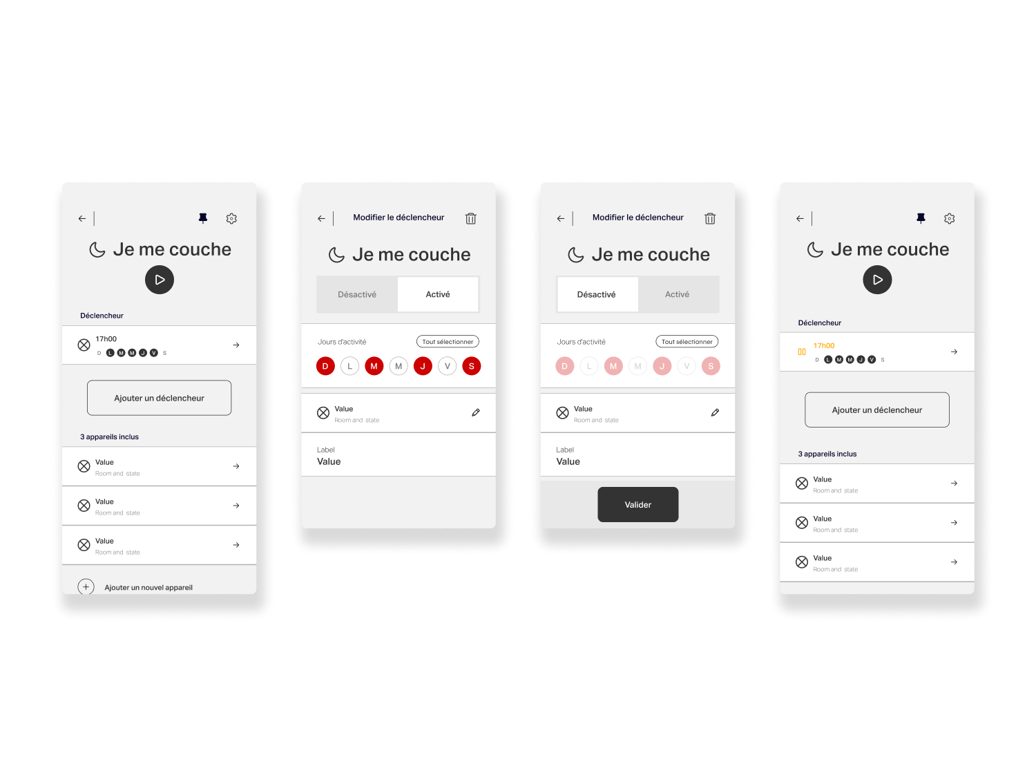
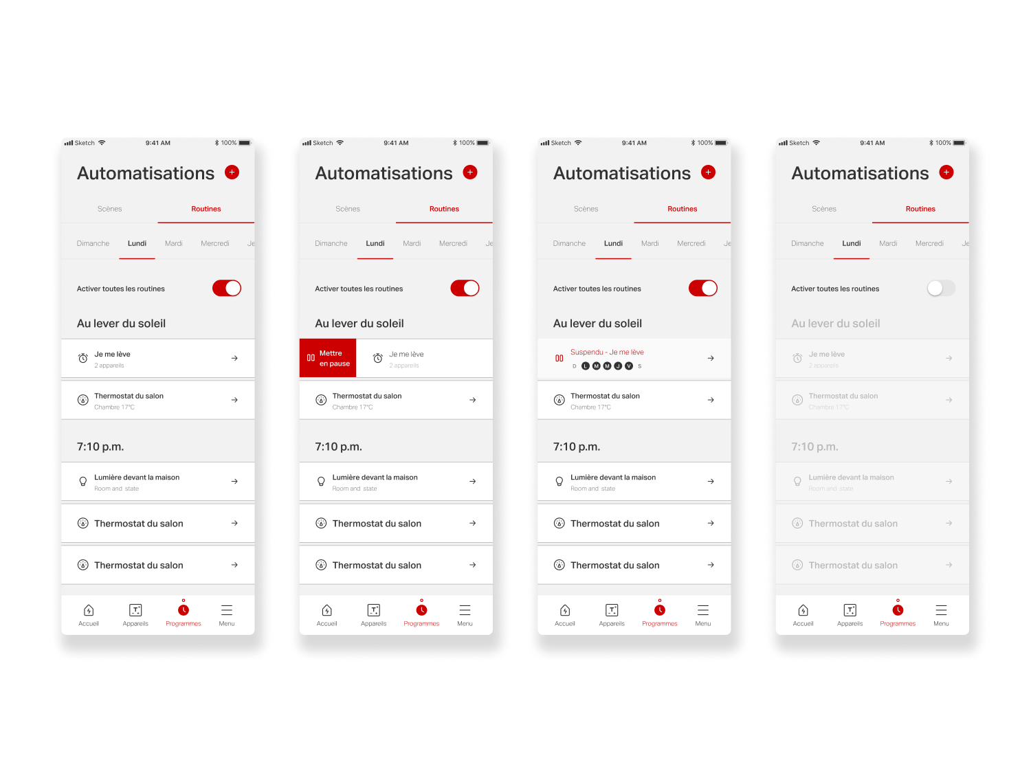
To improve clarity, the section was renamed Automations, grouping both Scenes and Routines under a single, consistent concept. The distinction between the two is defined by automation logic: a scene represents a manual configuration, while a routine applies the same setup automatically based on a trigger, schedule, or recurrence.
Unify Configuration & Logic
Results highlighted the value of simplifying configuration workflows and improving action discoverability. Refinements to creation, editing, duplication, and scheduling flows reduced friction and made advanced controls feel accessible, supporting faster setup and more flexible use without overwhelming the user.
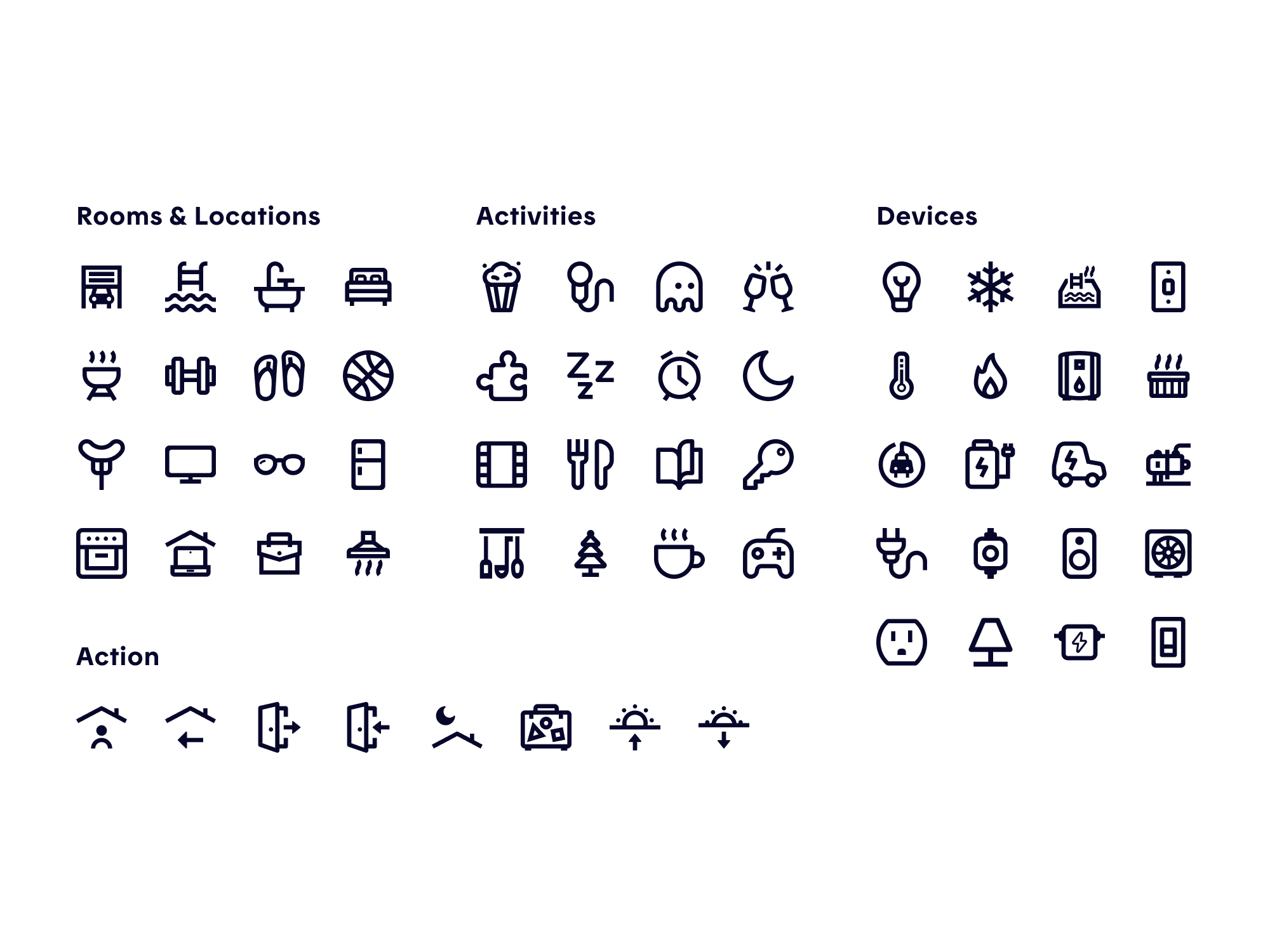
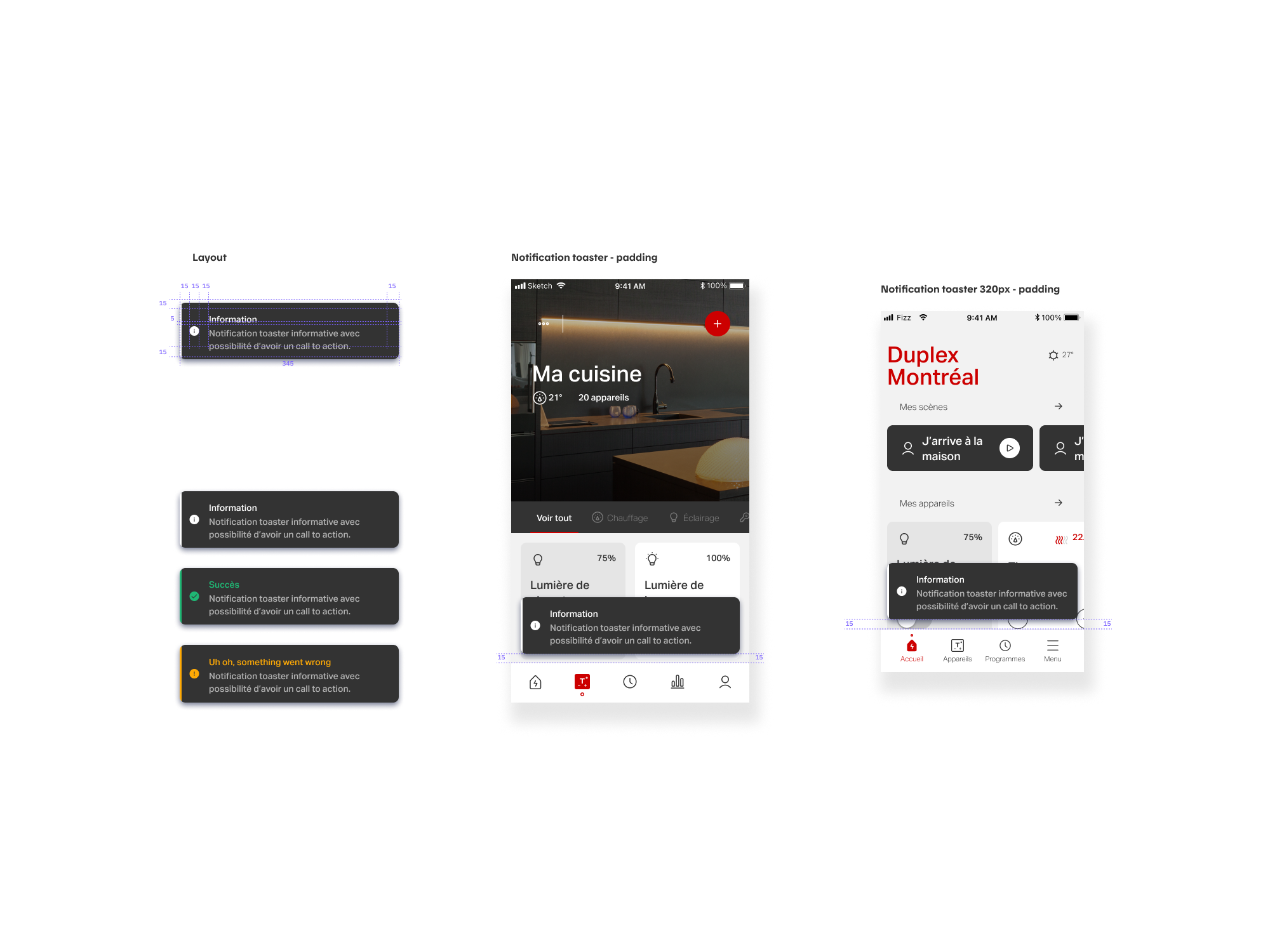
In addition, we created toaster notifications to improve the app’s feedback overall and specifically for automations creation. We also added new icons (Rooms and Location, Action, Ambiance, and Devices) with on/off states to deepen flexibility and personalization to the scenes and routines configuration.


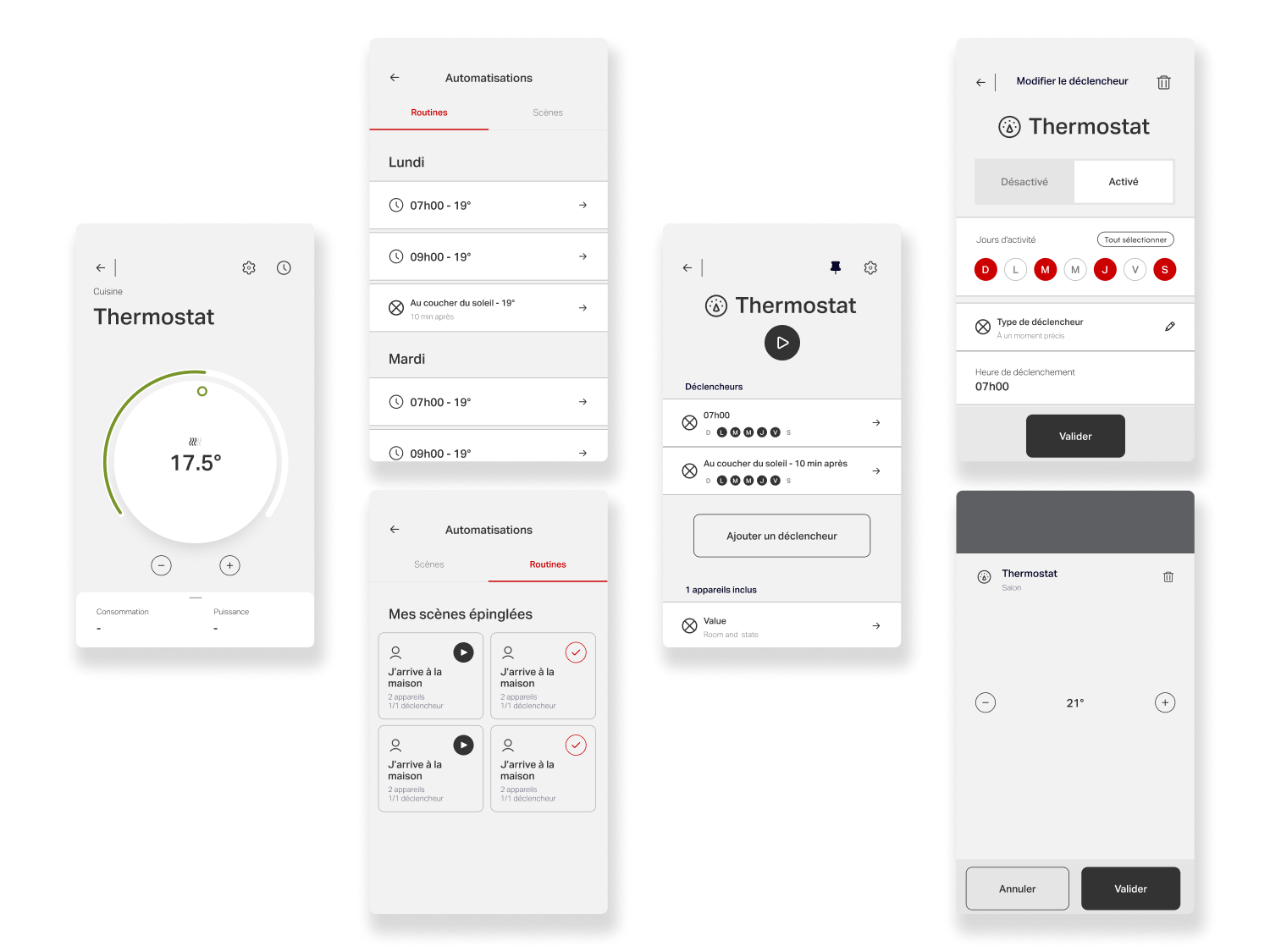
Simplifying Device Cards & Pages
Objectives
A last key project focused on simplifying the device cards and device pages across the app. As the product evolved and new connected devices were introduced (such as weather stations, smoke detectors, EV charging stations, and water heaters) each came with distinct data, states, and interaction flows. While quick solutions had been implemented to support these needs, they led to growing visual and experiential inconsistencies. The challenge was to rethink the system holistically, unifying patterns and simplifying interfaces to create a more coherent, scalable experience across all device types.
Challenges
As Hilo’s device ecosystem expanded, the Devices experience needed to support a growing range of connected products, each with distinct states, data structures, and interaction models, without fragmenting the user experience. The challenge was to help users instantly understand what was happening with a device (status, room context, energy usage, available actions) while keeping the interface clear and scannable. This required identifying shared interaction patterns that could unify the experience while still accurately expressing each device’s specific behaviors and states.
Design Process
The solution began with a systematic audit of all supported devices, mapping their data, states, modes, and user actions. By identifying common attributes and recurring behaviors, we established a set of shared patterns that could be translated into scalable UI components. These insights informed targeted evolutions of the design system, enabling greater consistency across device pages and cards while accommodating product-specific nuances.
Scalability was a core constraint throughout the process. Because the Devices experience was shared with the Allia app, all solutions had to be system-driven and adaptable to different brand expressions. We focused on modular components and interaction principles that could flex visually without altering underlying behaviors, ensuring long-term maintainability and a cohesive experience across multiple products and platforms.


Explore More
Explore More
Explore More
Explore More

UHG Spark App
UHG Spark App

The Honest Kitchen