UnitedHealth Group
What we did
Industry
Healthcare
Tools
Figma
Year
2024
Overview
UnitedHealth Group (UHG) is a health care company that provides health insurance benefits for employers, individuals, and Medicare/Medicaid beneficiaries.
This project focused on Smart Answer, an AI-powered search and knowledge tool within the UHG Sparq internal app. Smart Answer enables employees to query internal resources using natural language and receive summarized, source-based answers.
My role was to quickly audit and elevate the Smart Answer experience, improving clarity, usability, and trust in the AI output, while aligning the product with emerging AI interaction patterns and accessibility standards.

Improve comprehension and adoption of the Smart Answer AI feature. Reduce friction in natural-language search and follow-up interactions. Increase visibility, confidence, and perceived value of AI-generated answers. Establish clear guidance and onboarding for first-time and returning users. Align the experience with best-in-class AI tools and interaction models.
01. Synthesize User Recordings
I analyzed recorded user sessions to uncover real-world behavior and usability gaps, revealing a need for clearer intent feedback, better guidance around search inputs, stronger follow-up interactions, and more visible system feedback to build user confidence in the AI experience.
02. Audit & Research
I conducted an experience audit and benchmarked leading AI products such as ChatGPT, Gemini, and Copilot to evaluate interaction patterns, system feedback, and conversational flows, identifying key best practices which directly informed the redesigned Smart Answer experience.
03. Recommendations & Wires
I translated research insights and benchmarking findings into a set of actionable product recommendations and wireframes, defining clear interaction patterns, content hierarchy, and system feedback states for the Smart Answer experience.
Design Process
User Research & Insights
I reviewed recorded user sessions to observe real-world behaviour and friction points. Key insights emerged quickly:
Users naturally spoke in human language but lacked feedback on how well their intent was understood. Searches under three words consistently returned weaker results, without explanation. Follow-up questions were underused due to placement and unfamiliar interaction patterns. Users wanted reassurance that the system was actively “working” after submitting a query. These findings informed early experience recommendations around visibility, education, and feedback.
Challenges
The Smart Answer experience suffered from low visibility, with users often failing to recognize it as a distinct AI-powered feature. System behavior was not sufficiently transparent, leaving users unclear on how results were generated, which sources were used, or what limitations existed. Follow-up questions were consistently underutilized due to poor placement and misalignment with established search habits. In addition, the lack of guidance around search syntax, such as minimum word count, examples, and expected outcomes, introduced unnecessary cognitive load. Limited feedback during loading and processing further weakened user trust, reducing confidence in the AI’s ability to deliver reliable answers.
Benchmarking & Best Practices
To ground decisions in proven patterns, I benchmarked leading AI tools, including ChatGPT, Gemini, and Copilot. Common principles emerged:
– Immediate visual acknowledgment of user input.
– Clear loading states signaling AI reasoning and processing.
– Prominent, conversational follow-up inputs.
– Lightweight education embedded directly in the experience.
These patterns became the foundation for Smart Answer’s redesigned interaction model. Then, I translated research insights and benchmarking findings into actionable product recommendations, user journey flows, and wireframes, defining clear interaction patterns, content hierarchy, and system feedback states.
User Flow & Insights
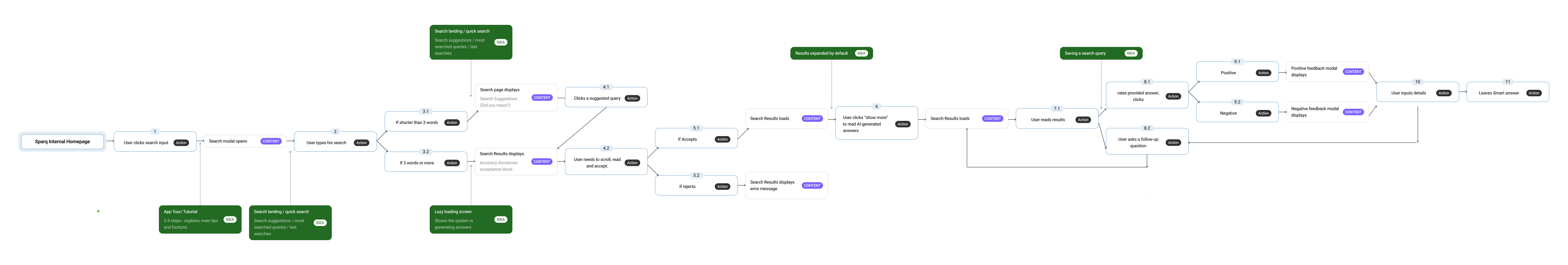
Key Features
Onboarding & Education
A lightweight in-product tutorial was introduced to increase activation and reduce time-to-value by clearly communicating Smart Answer’s behaviour and capabilities from the first interaction. The app tour is triggered on first visit and summarizes core features and usage patterns through a short, focused sequence. Limited to three to four steps to minimize cognitive load, the tutorial explains how natural-language search works, how results are generated, and how to refine answers through follow-up questions. The experience was designed to be iterative and measurable, with the ability for users to relaunch the tutorial at any time via a “View Tutorial Again” call to action, supporting ongoing learning and feature discovery.
Key Features
Guidance & Contextual Help
The Quick Search landing page elevates Smart Answer through stronger visual hierarchy and AI-forward styling inspired by best-in-class models. Bolder, more colorful treatments and directional microcopy guide users in performing effective natural-language searches, while inline tips and top-level query suggestions support searches under three words. Clear examples demonstrate how to phrase queries, and transparent messaging explains that results are synthesized from up to three trusted sources, building confidence, clarity, and trust from the first interaction.
Key Features
Feedback, Accessibility & Interaction Clarity
Introduced lazy loading states to signal that the system is actively processing results.
Improved color contrast, emphasis, and structure to support accessibility.
Repositioned inputs to align with familiar top-search mental models.
To reinforce trust and clarity:
Smart Answer was given stronger visual hierarchy and prominence. User queries are echoed back in the results area to confirm understanding. AI indicators and symbols are consistently repeated to reinforce system behaviour. Follow-up input was elevated visually and supported with directional copy. These changes helped normalize conversational search and reduce hesitation.
Key Features
Saved Searches & Continuity
To support recurring workflows and frequent knowledge needs, Smart Answer introduced the ability to save search queries for later reuse. This feature adds flexibility and convenience, allowing users to quickly return to commonly searched topics without retyping or reformulating queries. The experience surfaces the last three searches directly on the main page for fast re-triggering, while a dedicated saved searches view provides access to a broader history with simple management controls, including deletion. By accounting for repeated questions and ongoing issues, saved searches reinforce Smart Answer as a reliable, efficient, and repeatable tool within daily workflows.
The Outcome
The redesigned Smart Answer experience significantly improved clarity, usability, and trust in AI-driven search. Clearer system communication and transparency around how answers are generated reduced user uncertainty, while streamlined onboarding accelerated time-to-value and minimized early friction. Stronger visual emphasis and guidance increased discoverability and adoption of key features, including follow-up questions and saved searches. Overall, the experience now supports a more confident, human-centered approach to enterprise AI search, aligned with modern product expectations and designed to scale across diverse user needs.
Explore More
Explore More
Explore More
Explore More

The Honest Kitchen
The Honest Kitchen

Clos Des Saints